
If you are using Squarespace's Fluid Engine, you have probably run into this frustrating scenario: you place a video block on your page, stretch the corners to fill the grid, and instead of a beautiful edge-to-edge video, you are left with massive black bars and awkward video block padding.
You are not alone. Whether you are trying to make a video block fill the frame, figure out how to make video blocks portrait on Squarespace, or simply get your video to fill the container, the native Squarespace video player has some strict limitations.
Here is exactly why that happens and how you can easily fix it using a free tool—no custom coding required.
The Problem: Fixed Squarespace Video Aspect Ratios
By default, the native Squarespace video block is locked into a 16:9 landscape aspect ratio. While the Fluid Engine allows you to drag the block to any size, the content inside refuses to adapt.
This causes several major design headaches:
- Content not filling the video block: When you drag a block to be square or tall, the 16:9 video stays small in the middle, leaving empty space around it.
- No native support for a 9x16 video in Squarespace: If you want to embed a vertical video (like a Reel or TikTok), the native player will shrink it down and add heavy letterboxing.
- Inability to easily crop video in Squarespace: The native block doesn't allow you to use an object-fit: cover effect to dynamically crop the edges of the video so that it perfectly fits your layout.
Many users resort to complex custom code to change the video to fit the block or look for ways on how to add video to Squarespace without YouTube to get a cleaner look. Fortunately, there is a much simpler way to get a true full width video block or a seamless portrait video.
The Solution: The Responsive Fullsize Video Block
To completely bypass these native Squarespace video dimensions limits, you can use the Responsive Fullsize Video Block via the Redesignee extension.
This custom widget acts like a responsive background image. It allows you to input raw .mp4 links, YouTube URLs, or Vimeo links, and it will dynamically stretch, crop, and fill whatever Fluid Engine container you put it in.
Step-by-Step Guide to Filling the Block:
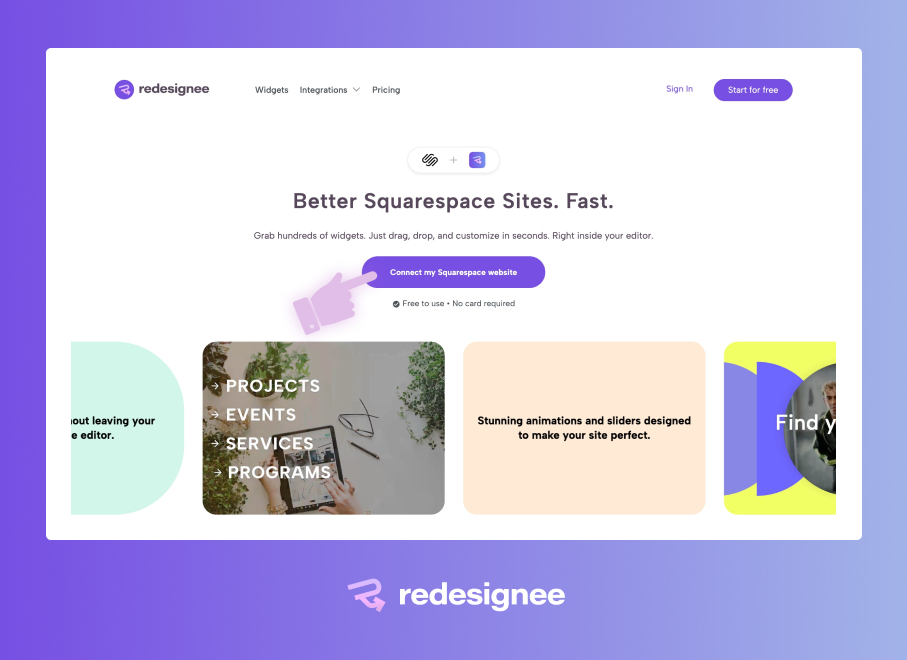
Step 1: Connect the Extension. First, you need to connect the free Redesignee extension to your Squarespace website.
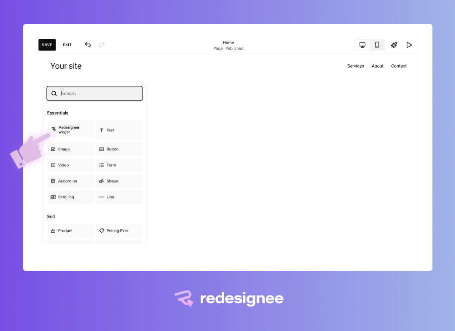
Step 2: Add the Widget to Your Page. Once connected, open your Squarespace page editor. When you click to add a new block, you will now see a "Redesignee widget" block available in your editor menu. Add it to your layout, open the block settings, and search the library for "Responsive Fullsize Video Block".
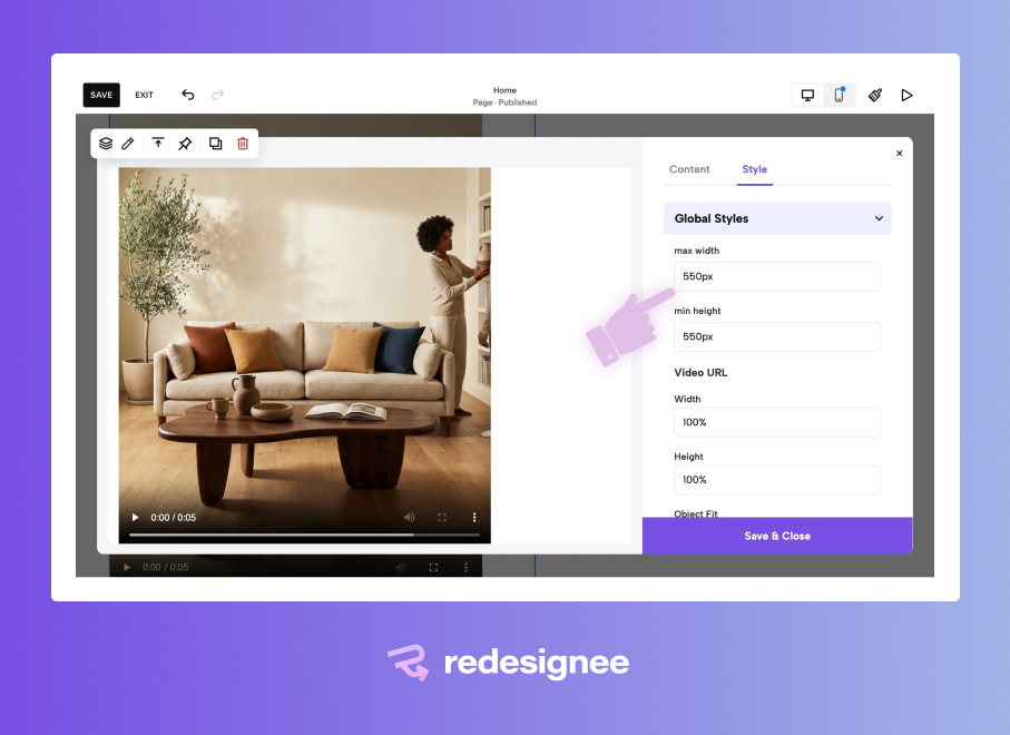
Step 3: Set Your Parameters. Click into the widget settings. Here, you can define your custom max-width and height parameters. Once set, the widget will automatically fill your Fluid Engine block seamlessly while keeping those specific safe-sizing parameters in mind. No black bars, no awkward padding!
Why Stop at Video? The Broader Benefits of Redesignee
Fixing the aspect ratio of your videos is just scratching the surface. By connecting the Redesignee extension to your Squarespace site, you are essentially unlocking a massive library of premium design capabilities that normally require hiring a developer or wrestling with temperamental custom CSS.
Here is why thousands of web designers are adding Redesignee to their toolkit:
- Zero Custom Code Required: Whether you want advanced tabs, dynamic accordions, or interactive sliders, every widget is built to be customized visually. You no longer have to worry about a Squarespace platform update breaking your fragile CSS injections.
- Fluid Engine Native: Every widget, including our full-size video player, is engineered specifically to respect and adapt to Squarespace's Fluid Engine. They scale beautifully on mobile, tablet, and desktop without tedious media query adjustments.
- Lightning Fast Implementation: Instead of building complex layouts from scratch, you can drop pre-coded, highly optimized widgets directly onto your page in seconds. This drastically cuts down development time, allowing you to launch sites faster.
- SEO and Performance Optimized: Redesignee widgets are built with clean, modern HTML5 and lightweight scripts to ensure they don't drag down your page load speeds, keeping both your users and search engines happy.
See It in Action
Want to see how this looks before adding it to your site?
Check out the live demo of the Responsive Fullsize Video Block here.
By swapping out the native player for this responsive widget, you regain complete control over your grid. Whether you need a cinematic full-bleed banner or a sleek vertical video showcase, your videos will finally fit your design perfectly.



Comments (0)