While Squarespace is famous for its beautiful out-of-the-box templates, standard blocks are no longer enough to make a website truly stand out in 2026. If you want your site to feel like a bespoke, custom-coded experience rather than a generic theme, you need to break free from native constraints.
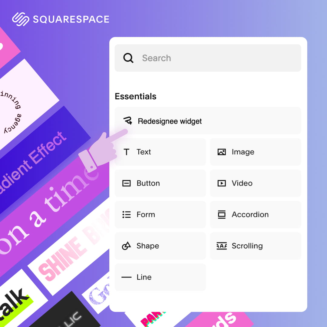
The secret to achieving that premium, agency-level polish without hiring a developer? Using high-quality Squarespace widgets.
By dropping interactive, motion-driven elements directly into your pages, you can instantly transform your user experience. If you are ready to upgrade your design, here are the 10 most impactful interactive Squarespace widgets trending this year.
1. Cinematic Hover Reveal Portfolio

Imagine a webpage that looks almost entirely blank—just a stark, beautifully typeset list of project names. It feels incredibly minimalist and clean. But the moment your cursor hovers over a project title, a massive, high-resolution image smoothly materializes right beneath your pointer, following it as you move. It creates an elite-level sense of mystery and discovery that makes standard grid layouts feel instantly outdated.
Best Used For: Agency portfolio grids, architectural showcases, or creative director lookbooks.
2. Case Study Hero Slider (With Left Thumbnails)

This layout dominates the screen with a massive, full-bleed background image that instantly immerses the user. On the left-hand side, a sleek, structured vertical column of small image thumbnails acts as your navigation. When a user clicks a thumbnail, the giant hero image smoothly glides into the next project. It turns a standard scrolling experience into a premium, curated narrative that feels incredibly high-end.
Best Used For: Homepage hero sections for design studios, premium product launches, or flagship case studies.
3. Editorial Testimonials Slider

Say goodbye to the standard, boring carousel of generic quotes. This widget relies on deep, bold, oversized typography that commands attention. Synced right alongside the text are crisp, perfectly cropped thumbnail navigators for each reviewer. The overall aesthetic feels less like a standard web component and much more like a pull-quote layout from a high-end fashion magazine or an editorial publication.
Best Used For: Consultant landing pages, SaaS proof sections, or boutique agency "What They Say" blocks.
4. Split-Layout Dynamic Tabs

This layout solves the problem of cluttered, text-heavy pages. The screen is split into two distinct halves. One side features a list of snappy, horizontal text tabs and stays beautifully locked in place. As the user clicks through the different tabs, the media on the opposite side of the screen fluidly crossfades to reveal new images, videos, or data. It delivers complex information with zero clutter and total clarity.
Best Used For: Feature breakdowns, core software capabilities, or multi-industry corporate service menus.
5. Editorial Press Marquee

Unlike aggressive pop-ups or flashy banners, this is an exercise in subtle prestige. It features a quiet, buttery-smooth, and infinite horizontal scrolling loop of your partner logos or press mentions. The animation is perfectly paced—not too fast to be distracting, but just dynamic enough to draw the eye. It adds a layer of absolute professionalism and trust to your page.
Best Used For: "As Seen On" validation ribbons placed directly beneath hero sections on startup or creator landing pages.
6. Grid Process Steps

If you have a complex method to explain, a vertical wall of text will lose your reader instantly. This widget maps out your multi-step execution plan into a satisfying, visually separated grid layout. Each step gets its own dedicated "card" or block, guiding the user's eye smoothly from step A to Z. It transforms a boring explanation into a friction-free, highly engaging visual journey.
Best Used For: "How We Work" sections for digital products, consulting frameworks, or client onboarding workflows.
7. Service Package Cards (With Feature Lists)

This is the ultimate conversion engine designed to make buying decisions easy. It presents beautifully balanced, side-by-side structural tiers that clearly separate your different service offerings. Inside each card is a meticulously styled feature checklist using custom bullet points that are highly scannable. It turns an overwhelming list of deliverables into a clean, appetizing menu.
Best Used For: Pricing pages, agency retainer tiers, or product tier breakdowns.
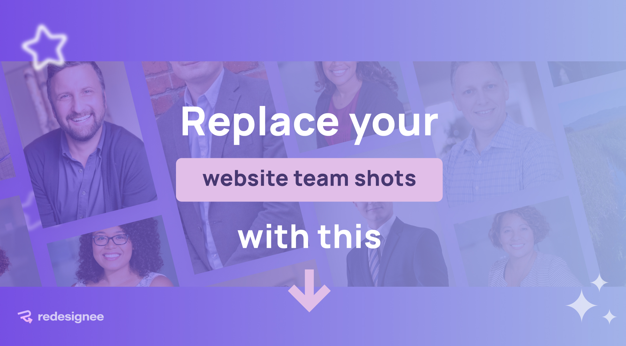
8. Image Testimonial Slider

Most websites hide their clients in tiny, 50-pixel circular avatars. This layout takes the opposite approach by placing a rich, massive, full-scale portrait directly alongside the client's story. When the user navigates to the next review, both the text and the giant portrait slide over with an incredibly smooth, satisfying transition. It connects a real face to a real result, generating massive visual impact and trust.
Best Used For: High-ticket coaching landing pages, client success story showcases, or service pages where human connection drives the sale.
9. Scroll-Activated Smart Accordion

Forget forcing users to click through endless plus and minus icons. This widget creates a frictionless reading experience by linking the accordion's movement directly to the user's mouse wheel. As they scroll down the page naturally, the text panels organically expand and collapse in perfect sync with their movement. It turns a standard document read into an engaging, fluid, and highly interactive story.
Best Used For: Detailed product documentation, comprehensive "How It Works" landing pages, or deep-dive agency capability breakdowns.
10. Numbered Accordion for Website

This layout is all about bold typographic structure. It uses massive, clean numbers (01, 02, 03) to break up text-heavy pages and establish an absolute, undeniable reading hierarchy. When a user clicks on one of those giant numbers, the accordion snaps open with a sharp, highly responsive micro-interaction to reveal the hidden content. It is striking, organized, and modern.
Best Used For: Step-by-step agency onboarding paths, structured strategy frameworks, or highly organized FAQ sections on conversion pages.
Upgrade Your Site in Minutes
You don't need to write a single line of custom code to bring these layouts to life. Redesignee builds these as ready-to-use, cloud-delivered Squarespace widgets that won't bloat your site or slow down your page speed.
Simply pick your style, customize the content, and drop the snippet directly into a Squarespace Code Block.
Browse the full Redesignee library today to start upgrading your site.
Comments (0)