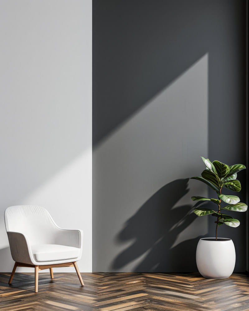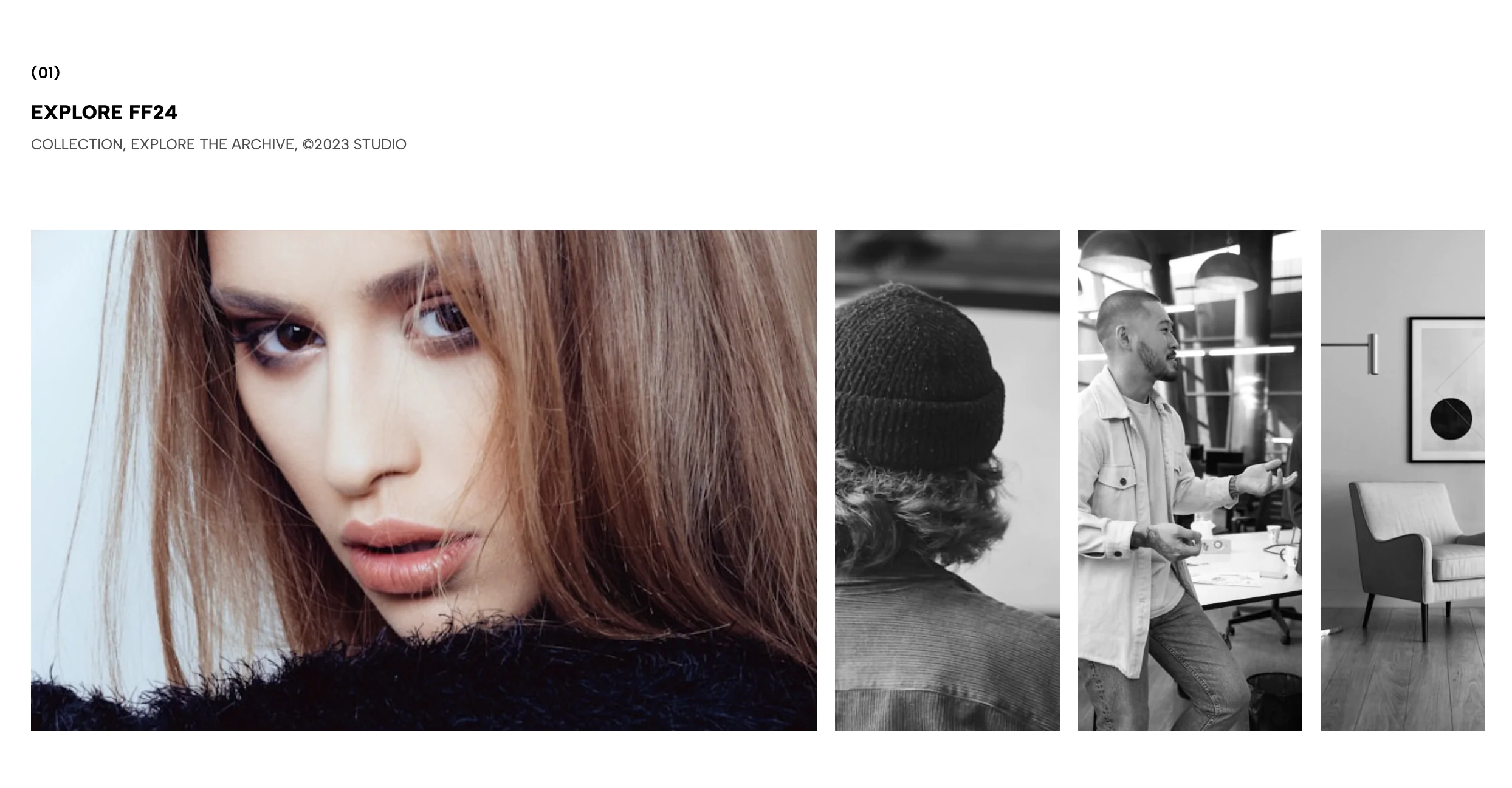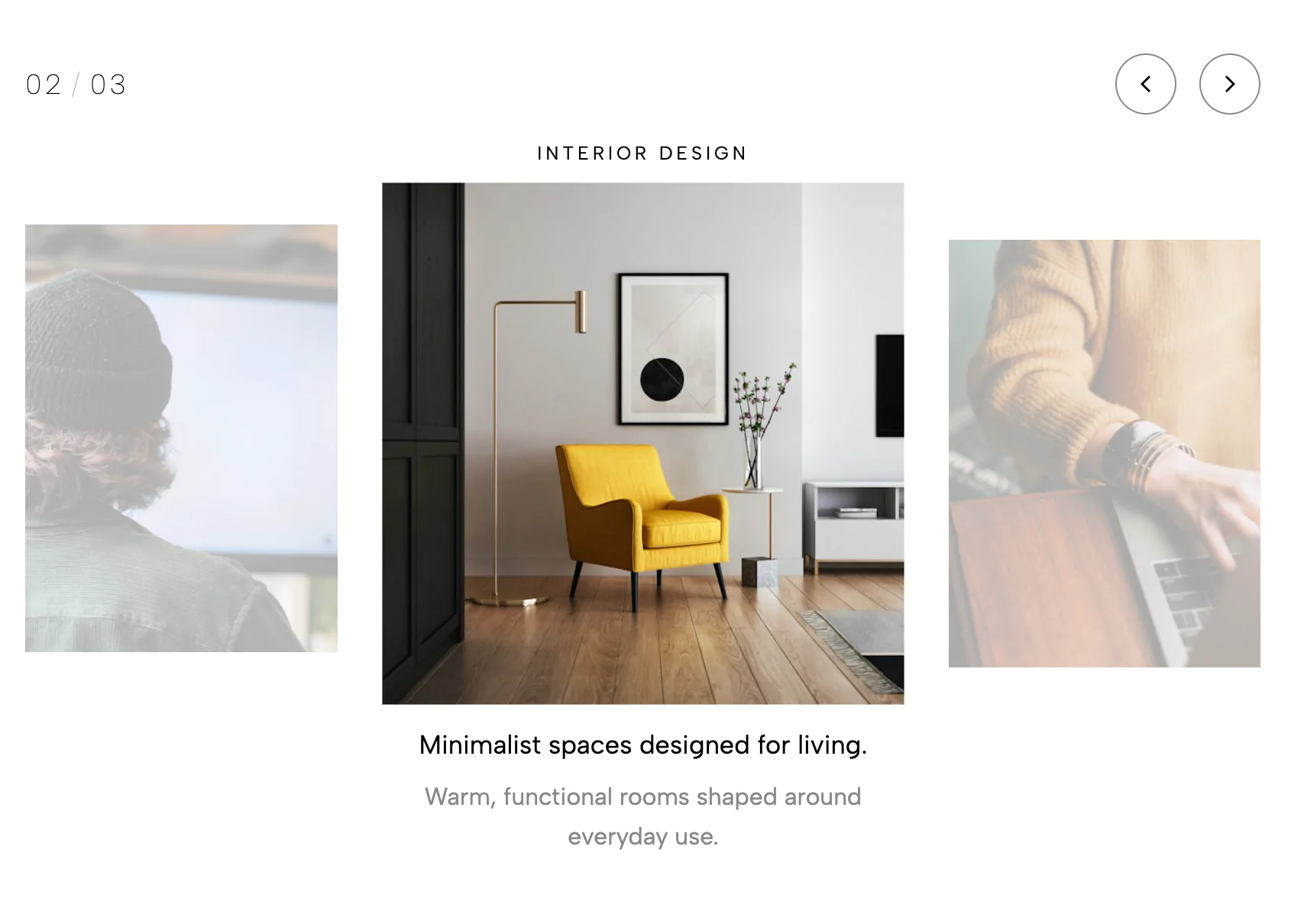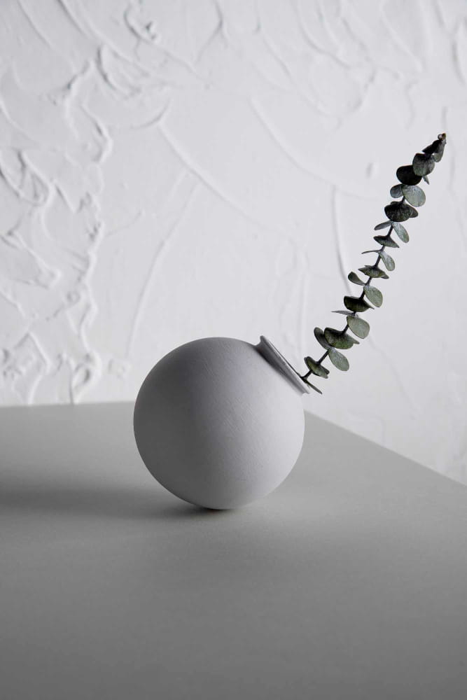

A minimal image slider with two images per slide, a centered overlay heading, slim SVG arrows, and smooth animated transitions.
When a standard single-image carousel feels too restrictive for your brand's storytelling, this dual-pane layout offers a highly refined alternative. It allows you to juxtapose two related visuals side-by-side, creating a rich, editorial browsing experience that feels like flipping through a high-end art book or design magazine.
This widget is a masterclass in whitespace, symmetry, and restraint, stripping away all unnecessary UI clutter to let your imagery breathe.
The Dual-Pane Layout: The design displays two equally sized images side-by-side, separated by a crisp, thin margin. This balanced, wide-format presentation is naturally pleasing to the eye and provides double the visual context per slide.
The Floating Centerpiece: Rather than overlaying heavy text blocks that obscure your beautiful photography, this layout utilizes a stark, solid white rectangular label perfectly centered over the seam between the two images. It acts as an elegant anchor and title card (e.g., "Surface Patterns") that bridges the two photos together.
Ultra-Minimal Navigation: The directional arrows are pushed entirely outside the boundaries of the images. By placing sharp, thin black chevrons in the negative space on the far left and right edges, the design guarantees zero obstruction of your visual assets.
The true power of the Minimal Two-Image Slider lies in its ability to facilitate storytelling through juxtaposition.
Single-image sliders force a linear, isolated view. By showing two images simultaneously, you can instantly communicate a relationship between them. You can pair a wide establishing shot with an intricate macro detail, or a lifestyle photo with an isolated product shot. The design invites the user to draw connections between the two panes, creating a much more engaging and thoughtful viewing experience.
Because of its ultra-clean, architectural aesthetic, this widget is absolutely perfect for premium brands that rely heavily on art direction and visual nuance. It is highly effective in the following scenarios:
Interior Design & Architecture: As shown in the preview, it is flawless for pairing a wide room view (like a dining area) with a close-up textural detail (like a vase or surface pattern) to convey both scale and craftsmanship.
High-End E-commerce & Fashion: Create a stunning lookbook by placing a full-body model shot on the left and a detailed macro shot of the fabric or accessories on the right.
Art & Photography Portfolios: Display your work in a classic "diptych" format, allowing two related pieces of art or photography to be viewed in conversation with one another.
Before & After Showcases: An elegant way for service providers (like renovation teams, makeup artists, or detailers) to show transformation without relying on clunky, outdated slider plugins.
Bring this layout to life on your website in just a few clicks.

Edit Minimal Two Image Slider visually using the native Squarespace extension
First, ensure you have connected your website to the native Redesignee extension. Once connected, you have two easy ways to build:
Native Block: Simply add the native Redesignee Widget Block directly from the fluid engine editor menu inside Squarespace.
Manual Markdown: Add a standard Code Block, paste your widget’s code snippet, and the Redesignee floating "Customize" button will automatically appear right over the block.
Both methods let you tweak settings, copy items, and design visually in real time. Saving your changes syncs the updates instantly to your live page.
See Squarespace installation guide
Connect natively via Gutenberg or Elementor
Make sure you have the free Redesignee WordPress Plugin installed. To drop the Minimal Two Image Slider into Elementor, simply drag and drop the Redesignee widget from your sidebar. If you are using the Gutenberg Block Editor, click the " + " icon and select the Redesignee Block. Launch the Cloud Library directly inside your workspace, choose your customized template, and import it with a single click. It automatically inherits your theme fonts and styles!
WordPress plugin installation guide
Quick copy-and-paste for custom setups
If you are using Webflow, Shopify, Wix, or a custom HTML site, click the "Export Widget" button on this page and ensure the platform selector is set to "HTML". Click "Copy" to copy the clean, un-nested source code snippet directly to your clipboard. Paste this code into any HTML component, Code Block, or Embed tool inside your website builder. All styles, animations, and scripts are self-contained and ready to run.
This Minimal Two Image Slider widget is optimized and categorized inside the following layout packs:
Stop building grid layouts from scratch. Browse our cloud library, customize interactive showcase sections visually, and copy-paste pristine code directly onto your design canvas.
Embrace pristine minimal structures. Tweak crisp whitespace templates visually inside our cloud canvas layout, copy the fast-rendering script output, and paste it straight onto your host site.
Bring asymmetric, magazine-style aesthetics to your web project canvas. Browse editorial grids and refined typography elements from our cloud repository and copy-paste clean code rows.
Make your layouts stand out instantly. Tweak advanced visual elements inside our cloud design workspace, copy the lightweight framework strings, and drop them seamlessly onto your canvas.
Grab your visitors' attention instantly. Browse our collection of native WordPress hero blocks, customize the typography and backgrounds visually, and copy the markup straight into your Gutenberg editor.
Launch stunning landing pages faster. Explore fully responsive Elementor hero sections with advanced layouts, tweak the design in our cloud library, and drop them seamlessly into your page builder.
Published:
Jul 19, 2026 05:00 AM
Category: