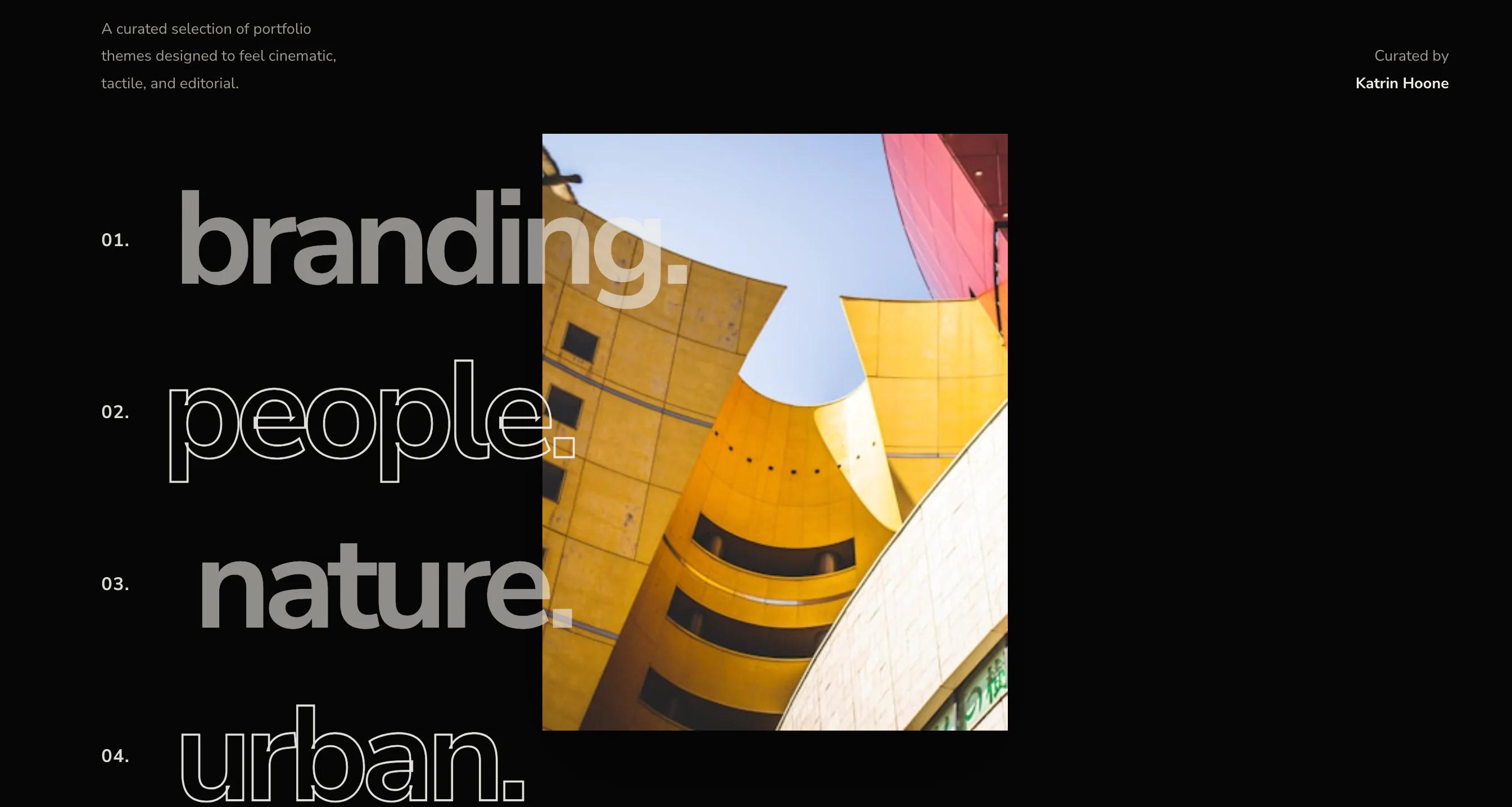
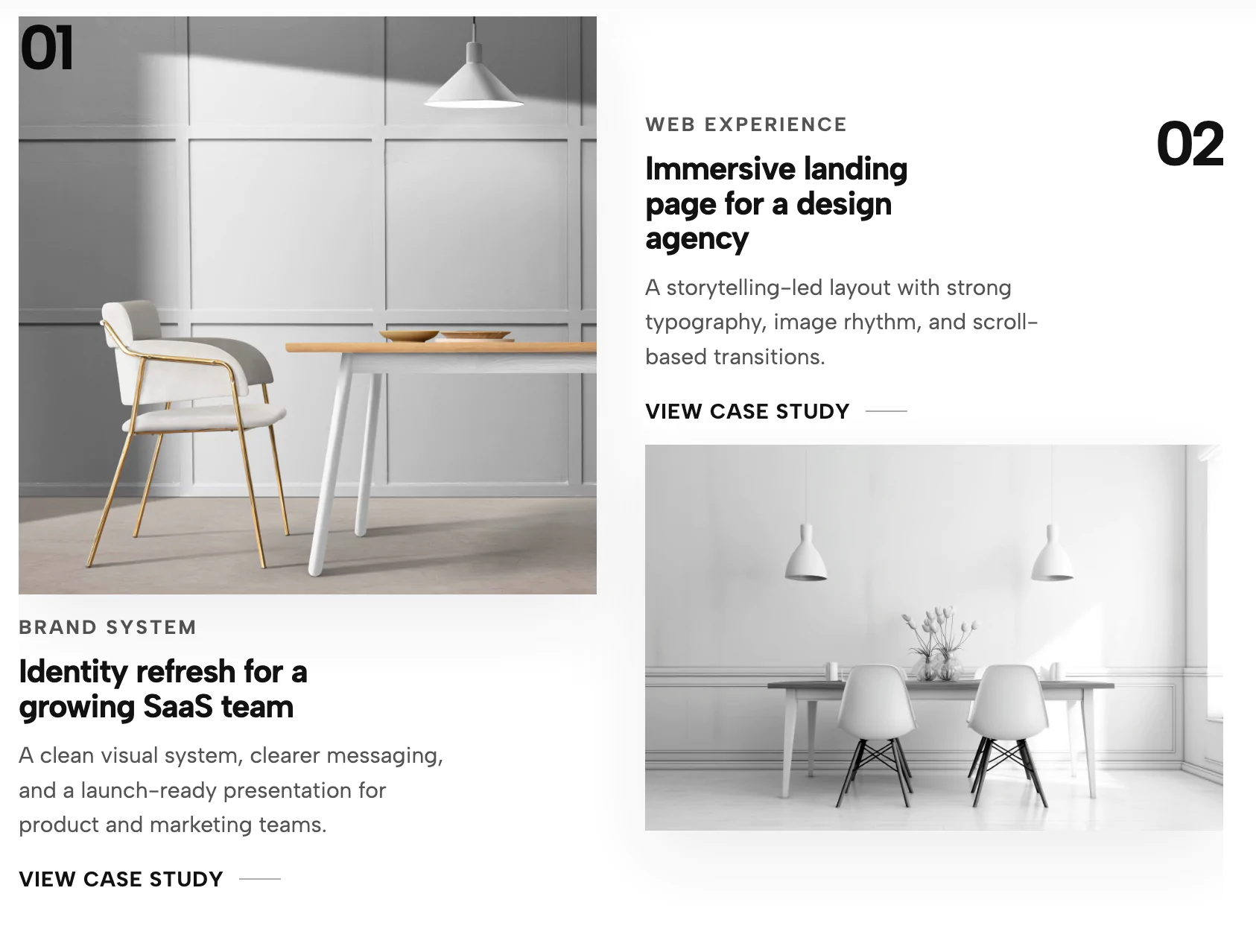
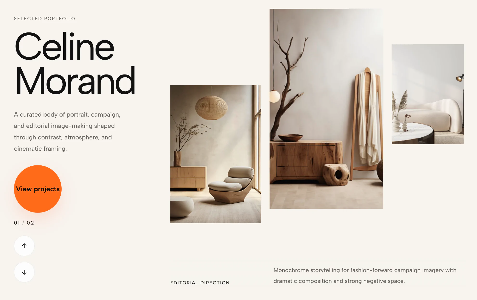
This Immersive Portfolio Case Study Grid is a high-end, conversion-focused solution designed for creative professionals who need to showcase their work with depth and sophistication.
The widget transforms a standard image gallery into an interactive, storytelling experience:
This widget is specifically built for industries where the "story" behind the project is as important as the final result:
Bring this layout to life on your website in just a few clicks.
Edit visually using the extension or native blocks
First, ensure you have pasted the global Redesignee connector script into your site's Code Injection settings. Once connected, you have two easy ways to build:
Native Block: Simply add the native Redesignee Widget Block directly from the fluid engine editor menu inside Squarespace.
Manual Markdown: Add a standard Markdown Block, paste your widget’s code snippet, and the Redesignee floating "Customize" button will automatically appear right over the block.
Both methods let you tweak settings, copy items, and design visually in real time. Saving your changes syncs the updates instantly to your live page.
See Squarespace installation guide
Connect natively via Gutenberg or Elementor
Make sure you have the free Redesignee WordPress Plugin installed. If you are using Elementor, simply drag and drop the Redesignee widget from your sidebar. If you are using the Gutenberg Block Editor, click the " + " icon and select the Redesignee Block. Launch the Cloud Library directly inside your workspace, choose your customized template, and import it with a single click. It automatically inherits your theme fonts and styles!
WordPress plugin installation guide
Quick copy-and-paste for custom setups
If you are using Webflow, Shopify, Wix, or a custom HTML site, click the "Export Widget" button on this page and ensure the platform selector is set to "HTML". Click "Copy" to copy the clean, un-nested source code snippet directly to your clipboard. Paste this code into any HTML component, Code Block, or Embed tool inside your website builder. All styles, animations, and scripts are self-contained and ready to run.
This Immersive Portfolio Lighbox Case Study Grid widget is optimized and categorized inside the following layout packs:
Stop building grid layouts from scratch. Browse our cloud library, customize interactive showcase sections visually, and copy-paste pristine code directly onto your design canvas.
Scale your studio production in record time. Access professional agency sections from our cloud workspace, tweak them visually, and drop clean, native elements straight into your client builds.
Embrace pristine minimal structures. Tweak crisp whitespace templates visually inside our cloud canvas layout, copy the fast-rendering script output, and paste it straight onto your host site.
Bring asymmetric, magazine-style aesthetics to your web project canvas. Browse editorial grids and refined typography elements from our cloud repository and copy-paste clean code rows.
Make your layouts stand out instantly. Tweak advanced visual elements inside our cloud design workspace, copy the lightweight framework strings, and drop them seamlessly onto your canvas.
Published:
Apr 18, 2026 09:21 AM
Category:
Tags: