Create a magazine-quality first impression with this Split-Screen Layered Hero Section. Designed for fashion brands, personal portfolios, and editorial websites, this widget utilizes a sophisticated 50/50 split layout to balance visual storytelling with clear, compelling messaging.
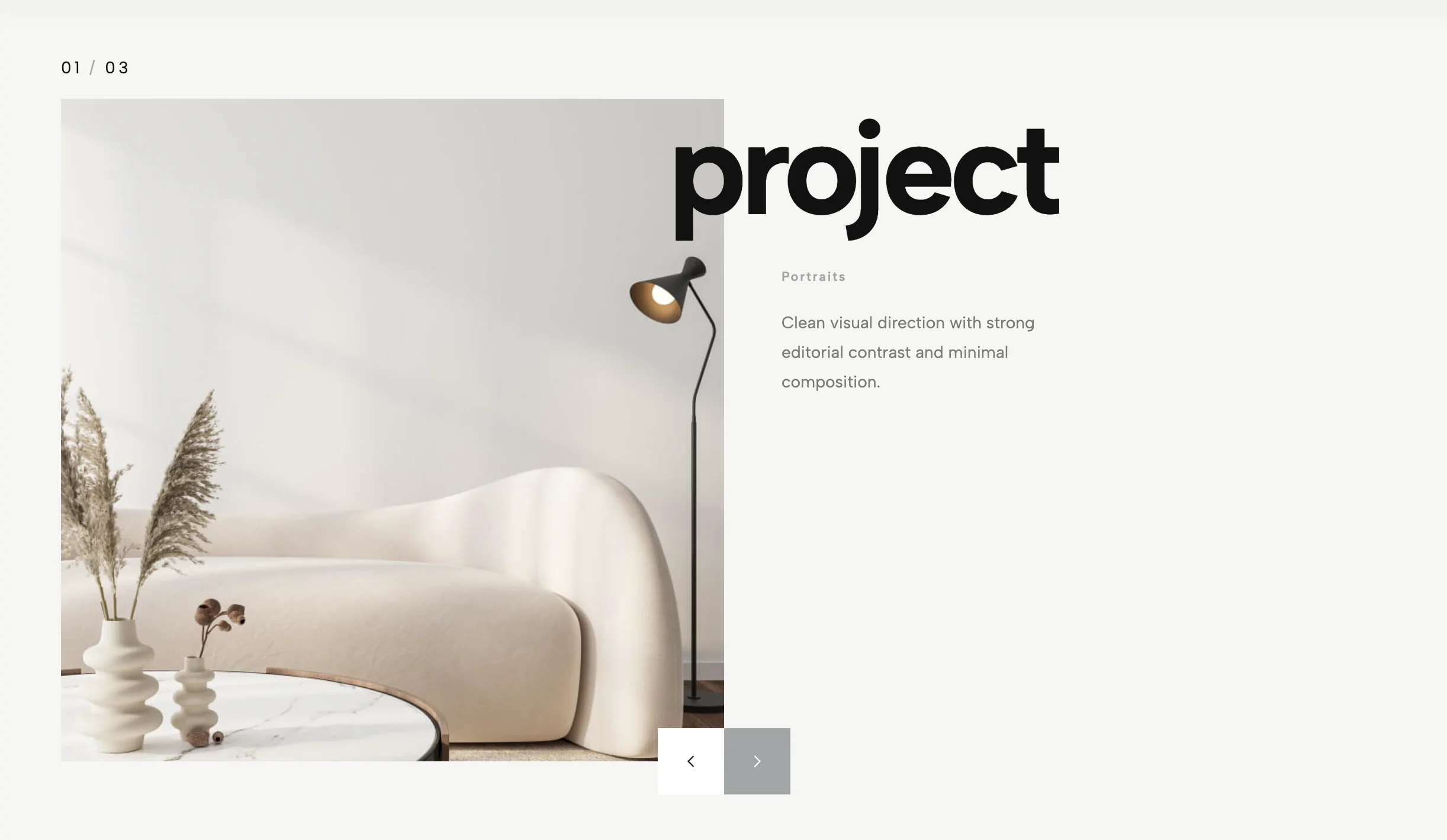
The left column features a unique dual-image composition: a full-height background image sets the mood (perfect for textures or scenic shots), while a centered, shadow-enhanced portrait image sits on top, creating depth and a strong focal point. This layered approach is ideal for showcasing a featured product, a model lookbook, or a personal brand profile.
The right column provides a clean, breathable canvas for your content. It includes a high-impact headline, a rich text area for your value proposition, and dual call-to-action buttons (primary and text link). The layout is fully responsive, stacking vertically on mobile devices to ensure your imagery remains impactful on any screen size.
Key Features:
Bring this layout to life on your website in just a few clicks.
Edit visually using the extension or native blocks
First, ensure you have pasted the global Redesignee connector script into your site's Code Injection settings. Once connected, you have two easy ways to build:
Native Block: Simply add the native Redesignee Widget Block directly from the fluid engine editor menu inside Squarespace.
Manual Markdown: Add a standard Markdown Block, paste your widget’s code snippet, and the Redesignee floating "Customize" button will automatically appear right over the block.
Both methods let you tweak settings, copy items, and design visually in real time. Saving your changes syncs the updates instantly to your live page.
See Squarespace installation guide
Connect natively via Gutenberg or Elementor
Make sure you have the free Redesignee WordPress Plugin installed. If you are using Elementor, simply drag and drop the Redesignee widget from your sidebar. If you are using the Gutenberg Block Editor, click the " + " icon and select the Redesignee Block. Launch the Cloud Library directly inside your workspace, choose your customized template, and import it with a single click. It automatically inherits your theme fonts and styles!
WordPress plugin installation guide
Quick copy-and-paste for custom setups
If you are using Webflow, Shopify, Wix, or a custom HTML site, click the "Export Widget" button on this page and ensure the platform selector is set to "HTML". Click "Copy" to copy the clean, un-nested source code snippet directly to your clipboard. Paste this code into any HTML component, Code Block, or Embed tool inside your website builder. All styles, animations, and scripts are self-contained and ready to run.
This Split Portrait Hero widget is optimized and categorized inside the following layout packs:
Stop building grid layouts from scratch. Browse our cloud library, customize interactive showcase sections visually, and copy-paste pristine code directly onto your design canvas.
Make an unmissable statement. Customize high-impact typography elements, brutalist layouts, and high-contrast sections from our cloud repository to craft layouts that refuse to be ignored.
Bring asymmetric, magazine-style aesthetics to your web project canvas. Browse editorial grids and refined typography elements from our cloud repository and copy-paste clean code rows.
Make your layouts stand out instantly. Tweak advanced visual elements inside our cloud design workspace, copy the lightweight framework strings, and drop them seamlessly onto your canvas.
Published:
Jan 08, 2026 10:53 AM
Category: