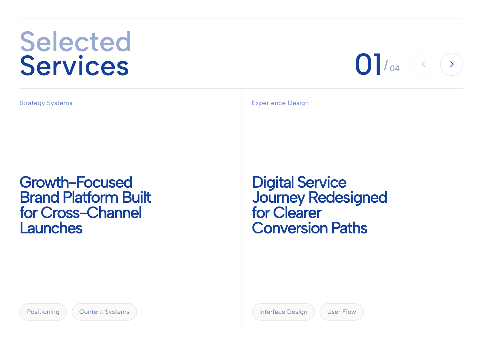
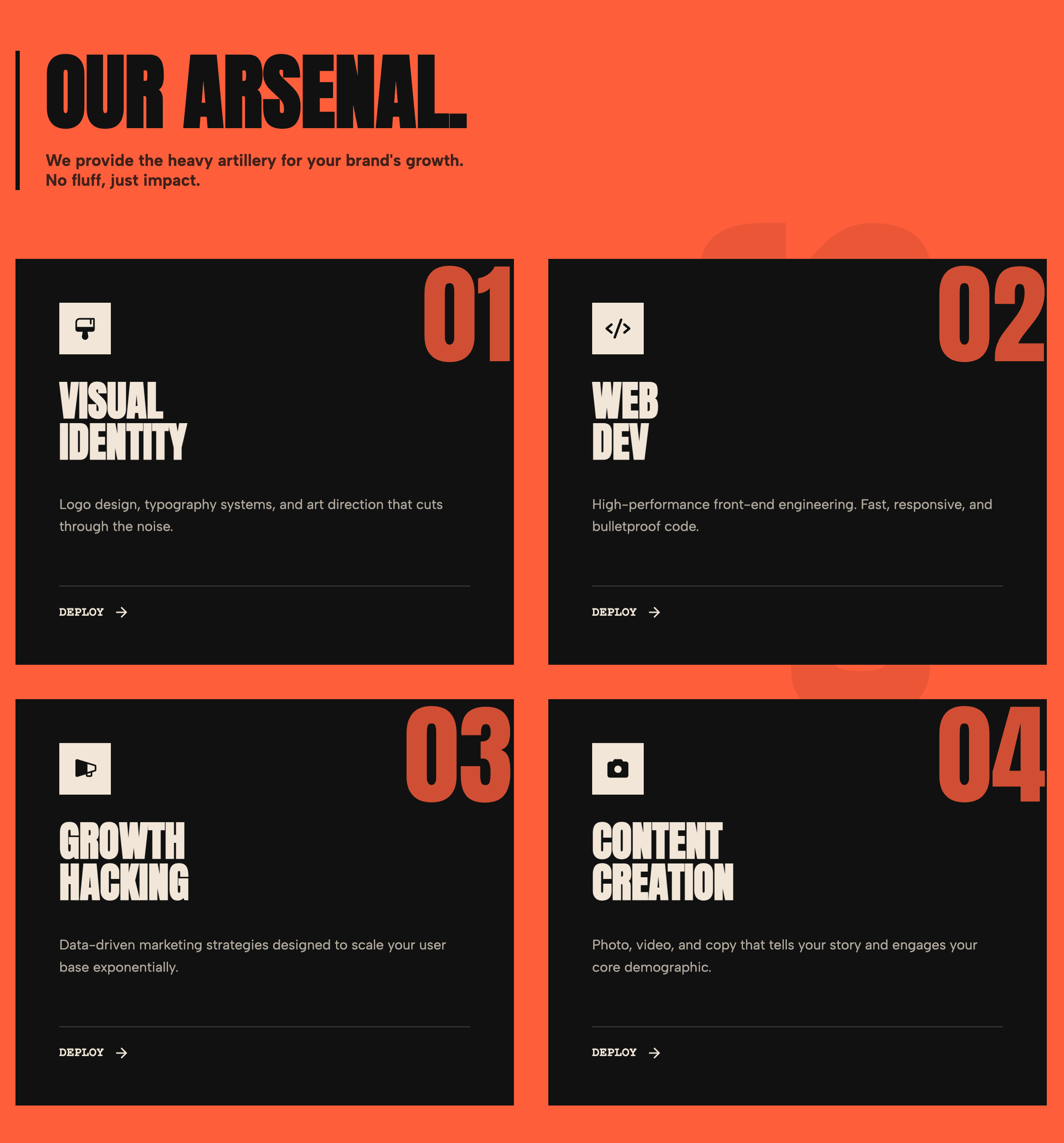
Elevate your offerings with the Vibrant Split-Card Grid, a high-impact layout designed to merge clear messaging with compelling visual storytelling. This widget utilizes a distinct two-part architecture:
Top Content Block: A solid color panel (customizable per card) that houses a pill-shaped category tag, a bold headline with stylized underlining, and a descriptive summary. This ensures your key value proposition is read first.
Bottom Visual Anchor: An image container that visually reinforces the message. It features a seamless Call-to-Action (CTA) overlay at the bottom, complete with a floating SVG arrow button that invites clicks.
The design is characterized by its friendly, modern aesthetic, featuring deeply rounded corners (32px) and a high-contrast color palette (defaulting to a trendy neon yellow accent). Interaction is baked into every element: hovering over the card triggers a subtle lift effect on the container and a smooth zoom on the product image, creating a tactile and responsive user experience.
This widget is incredibly versatile, making it perfect for displaying e-commerce product collections, service packages, or featured blog categories.
Key Features:
Bring this layout to life on your website in just a few clicks.
Edit visually using the extension or native blocks
First, ensure you have pasted the global Redesignee connector script into your site's Code Injection settings. Once connected, you have two easy ways to build:
Native Block: Simply add the native Redesignee Widget Block directly from the fluid engine editor menu inside Squarespace.
Manual Markdown: Add a standard Markdown Block, paste your widget’s code snippet, and the Redesignee floating "Customize" button will automatically appear right over the block.
Both methods let you tweak settings, copy items, and design visually in real time. Saving your changes syncs the updates instantly to your live page.
See Squarespace installation guide
Connect natively via Gutenberg or Elementor
Make sure you have the free Redesignee WordPress Plugin installed. If you are using Elementor, simply drag and drop the Redesignee widget from your sidebar. If you are using the Gutenberg Block Editor, click the " + " icon and select the Redesignee Block. Launch the Cloud Library directly inside your workspace, choose your customized template, and import it with a single click. It automatically inherits your theme fonts and styles!
WordPress plugin installation guide
Quick copy-and-paste for custom setups
If you are using Webflow, Shopify, Wix, or a custom HTML site, click the "Export Widget" button on this page and ensure the platform selector is set to"HTML". Click "Copy" to copy the clean, un-nested source code snippet directly to your clipboard. Paste this code into any HTML component, Code Block, or Embed tool inside your website builder. All styles, animations, and scripts are self-contained and ready to run.
Published:
Jan 19, 2026 03:19 AM
Category: