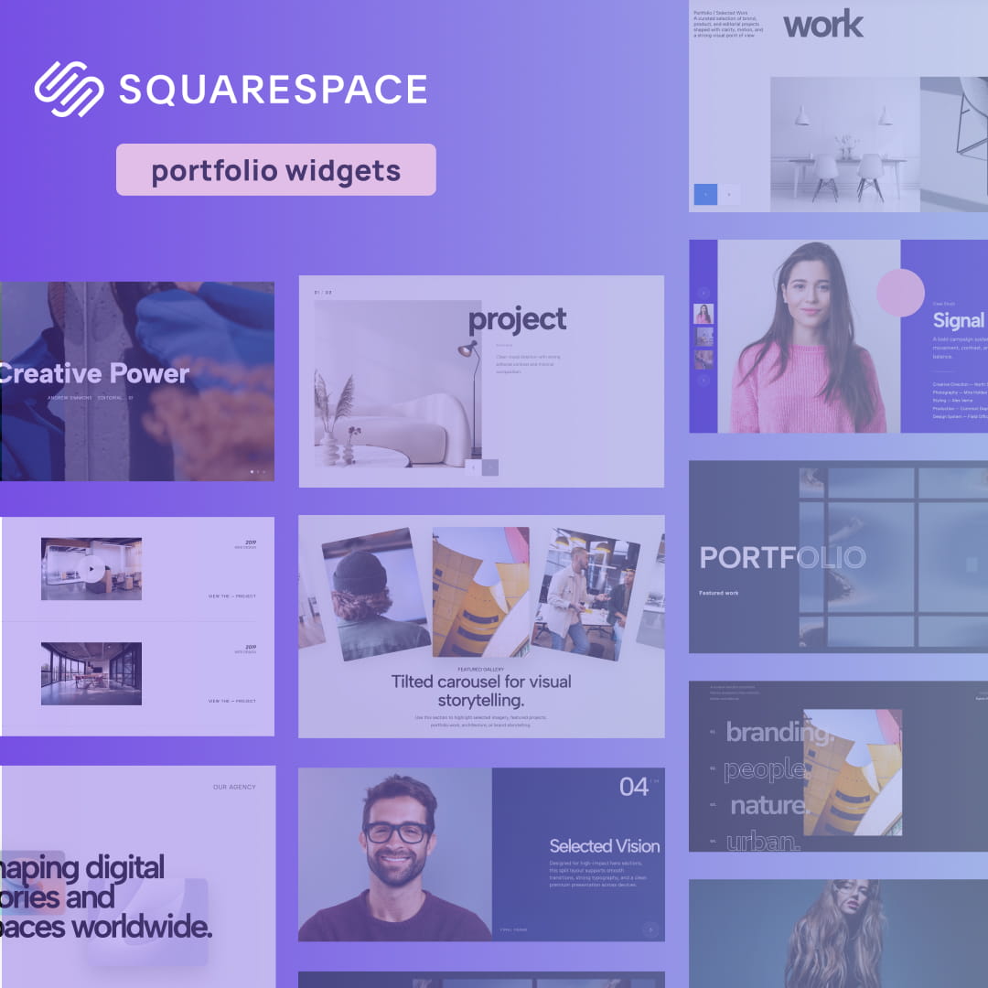
When you set out to create a portfolio website, Squarespace is naturally one of the top platforms that comes to mind. It is reliable, user-friendly, and offers some incredibly clean starting points. However, there is a catch: because it is so popular, thousands of creatives are using the exact same Squarespace portfolio templates.
If you are a designer, photographer, or creative director, blending in is not an option. You cannot afford to let your best work sit in a static, uninspired grid. To land high-ticket clients and stand out from the sea of standard Squarespace portfolio examples, you need to introduce depth, motion, and interactivity into your site.
Instead of paying a developer thousands of dollars to write custom code, you can easily upgrade your site using lightweight, premium widgets. We have compiled a massive list of the 21 best interactive layouts to help you break the mold. Whether you are looking for Squarespace portfolio design tips or just the absolute best Squarespace plugins for portfolio enhancement, these 21 widgets will transform your native site into an agency-grade experience.
1. Outlined Overlap Hero

The hero section is your digital handshake, and a standard, flat image block is a missed opportunity. This widget uses striking, oversized outlined typography intertwined with overlapping structural elements. It creates a bold, multi-dimensional aesthetic that grabs attention the second your page loads.
Why it works for your portfolio: If you are trying to build a custom site that screams "bespoke," this layout shatters the rigid, boxy constraints of built-in themes. It gives your header a raw, custom-coded, editorial edge that perfectly frames your creative identity.
👉 Live Demo: Get it now
2. Parallax Scroll Image Gallery
Ditch the basic grid. The Parallax Scroll Image Gallery brings your photography, mockups, or case study thumbnails to life by moving elements at different speeds as the user scrolls. This creates an immersive, 3D-like environment that pulls the viewer deeper into your work.
Why it works for your portfolio: An engaging online portfolio relies on keeping the user hooked. By adding a smooth parallax effect to your image galleries, you elevate the browsing experience from a simple scroll to a dynamic, visual journey.
👉 Live Demo: Get it now
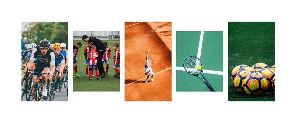
3. Scattered Scroll Gallery
Want to break away from perfect alignment and hard edges? The Scattered Scroll Gallery floats your images in a loose, organic arrangement. As the user scrolls down the page, the images drift and settle into place, creating a highly tactile and playful aesthetic.
Why it works for your portfolio: If you are a creative director or visual artist searching for unique design inspirations, this widget is a must-have. It brings a sense of weightlessness and artistic freedom to your layout, ensuring your work feels curated rather than just dropped into a generic template.
👉 Live Demo: Get it now
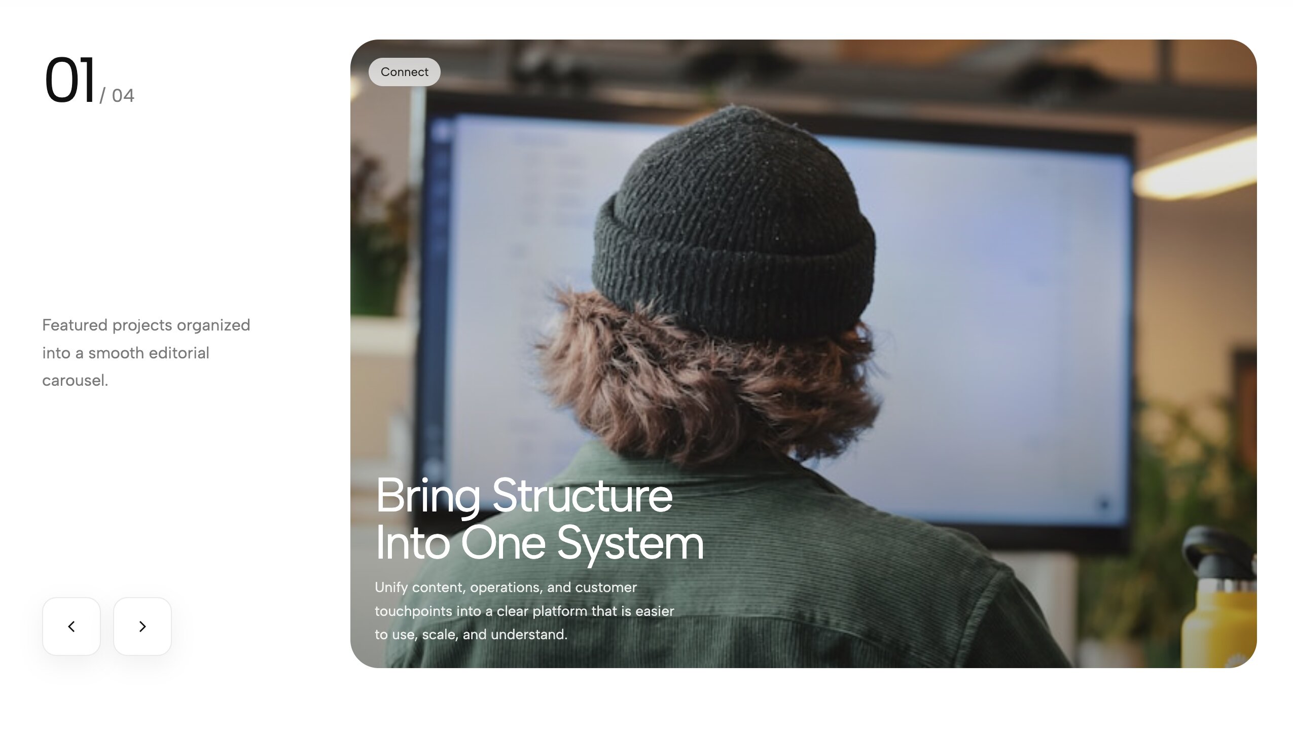
4. Portfolio Hero Carousel with CTA

Your best work should never be hidden behind multiple clicks. This layout combines a massive, highly visual project carousel right at the top of your homepage, paired seamlessly with a permanently visible Call-To-Action (CTA) block.
Why it works for your portfolio: One of the best web design strategies is to design for conversion, not just aesthetics. This widget lets potential clients browse your top-tier projects immediately while keeping the "Hire Me" or "Start a Project" button front and center.
👉 Live Demo: Get it now
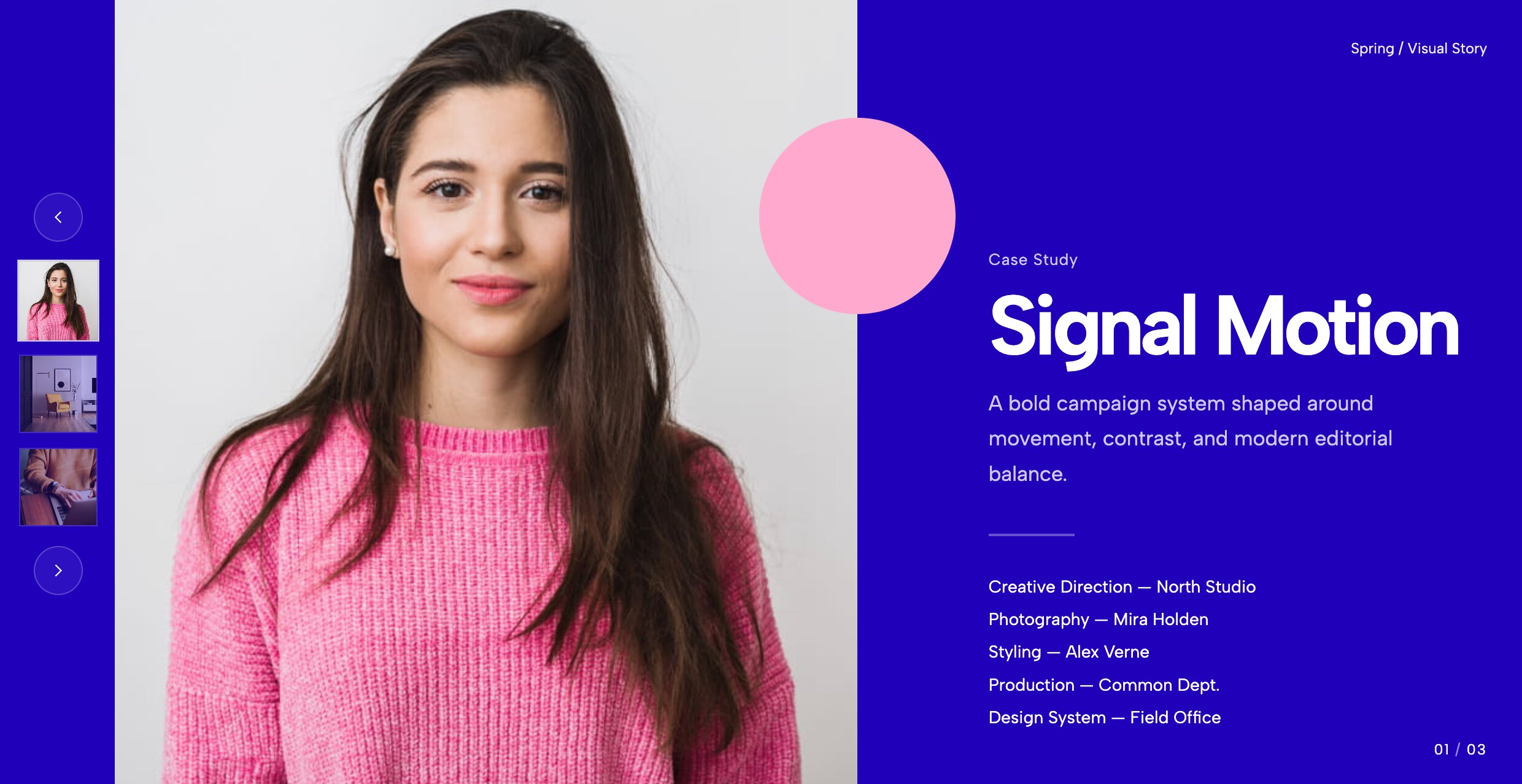
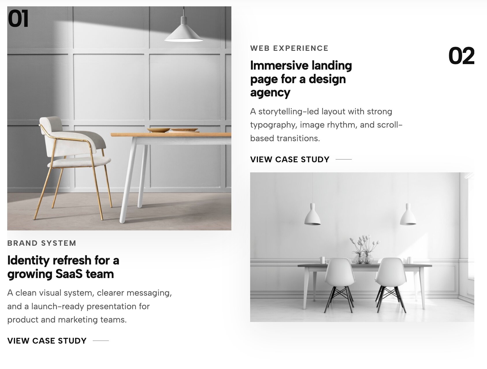
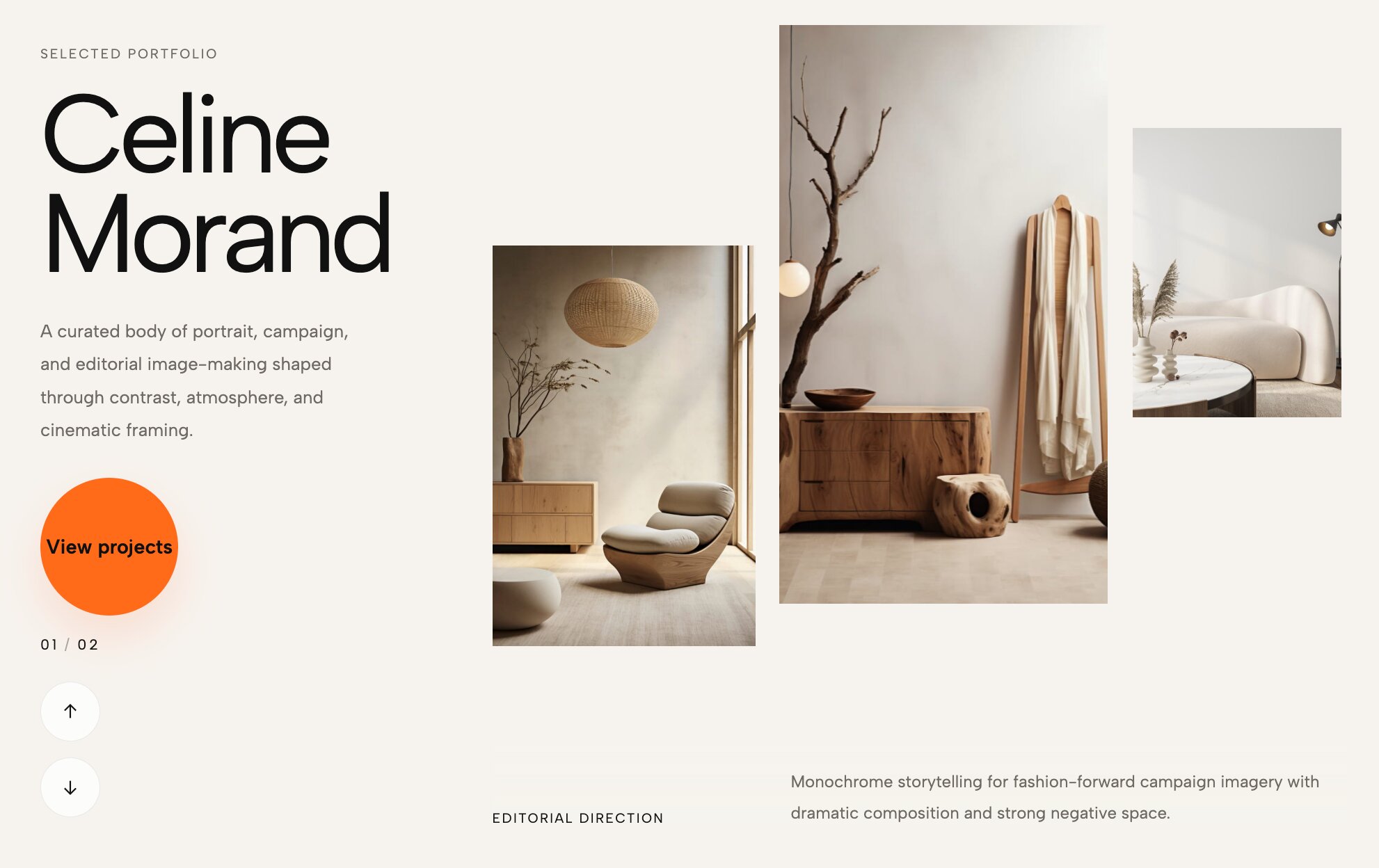
5. Case Studies Carousel with Split Layout
This widget elegantly solves the problem of balancing detailed text with beautiful imagery. It utilizes a split-screen design where one side holds your high-converting copy and project details, while the other side acts as a smooth, interactive slider showcasing the related case study images.
Why it works for your portfolio: For UX designers and strategists, context is everything. This layout is easily one of the top layout tools for storytelling, allowing you to explain your creative process clearly without sacrificing visual impact. It proves that a custom homepage layout can be both beautiful and highly functional.
👉 Live Demo: Get it now
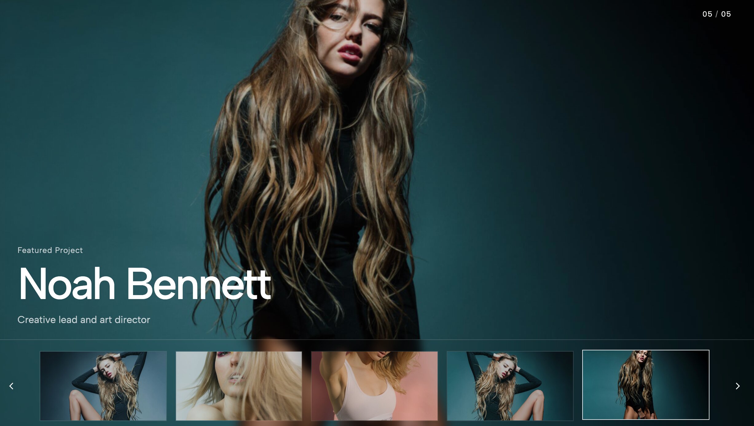
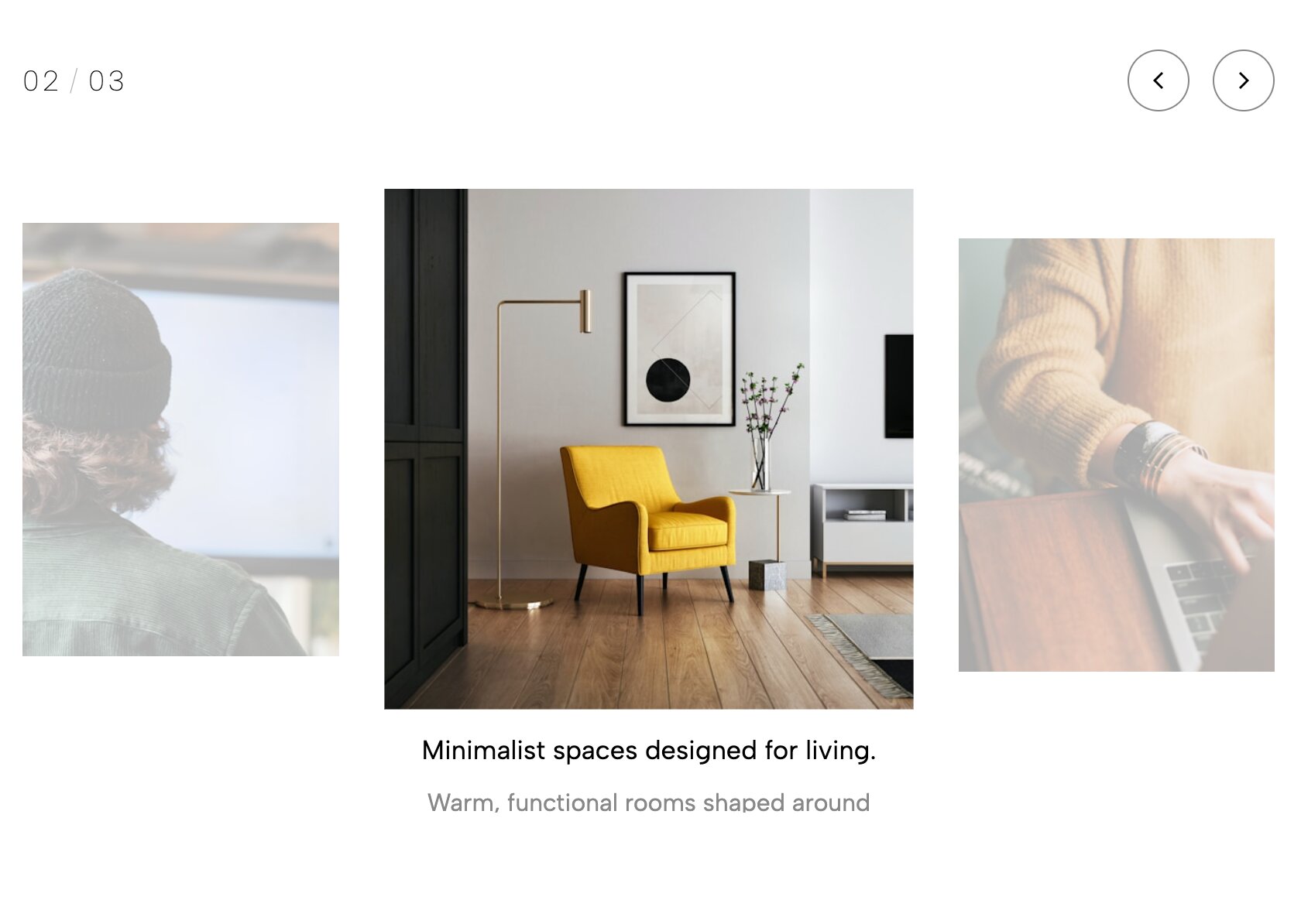
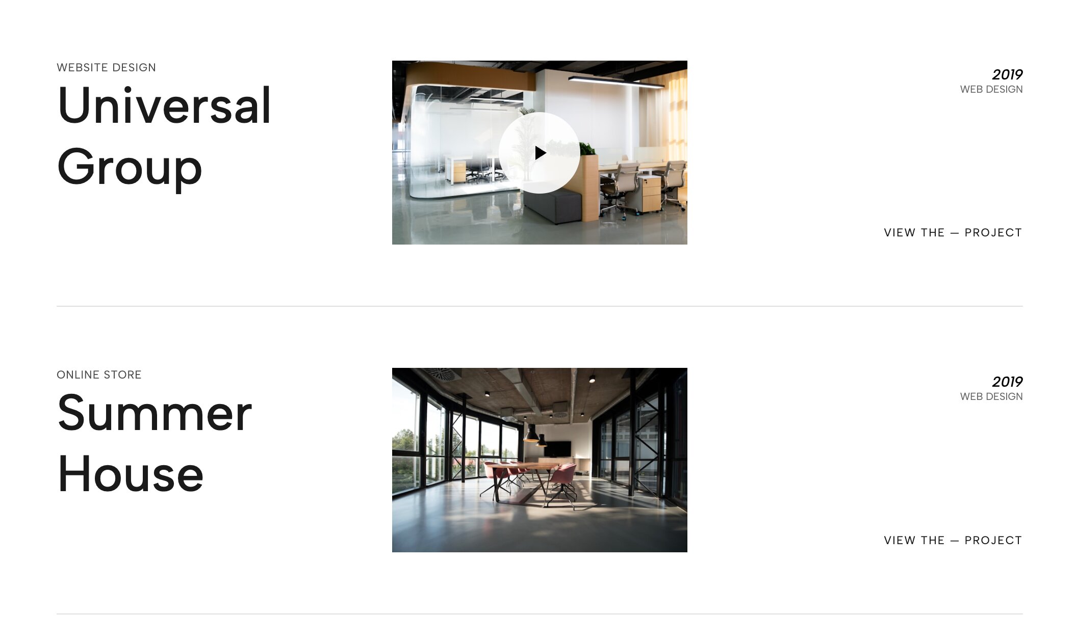
6. Case Study Hero Slider with Left Thumbnails
Most standard website builders force users to scroll endlessly to see your different projects. This interactive hero widget brings your best work right to the top, pairing a massive full-bleed background image with a sleek vertical column of clickable project thumbnails on the left side.
Why it works for your portfolio: If you want to launch a site that prioritizes user experience, this is an incredible UX strategy you can implement. It turns your header into an interactive narrative, encouraging visitors to explore multiple case studies immediately without ever leaving the top of the homepage.
👉 Live Demo: Get it now
7. Portfolio Hero Slider with Thumb Navigation
Similar to the left-aligned layout but tailored for a more cinematic, horizontal aesthetic, this widget places a sleek row of thumbnail navigation directly beneath or overlaying your main hero slider. It feels like navigating a premium streaming app.
Why it works for your portfolio: When clients are reviewing dozens of competitor sites, you only have seconds to capture their interest. This widget allows rapid, frictionless visual skimming. By letting them preview the next slide before they click, you keep them engaged and active on your site significantly longer.
👉 Live Demo: Get it now
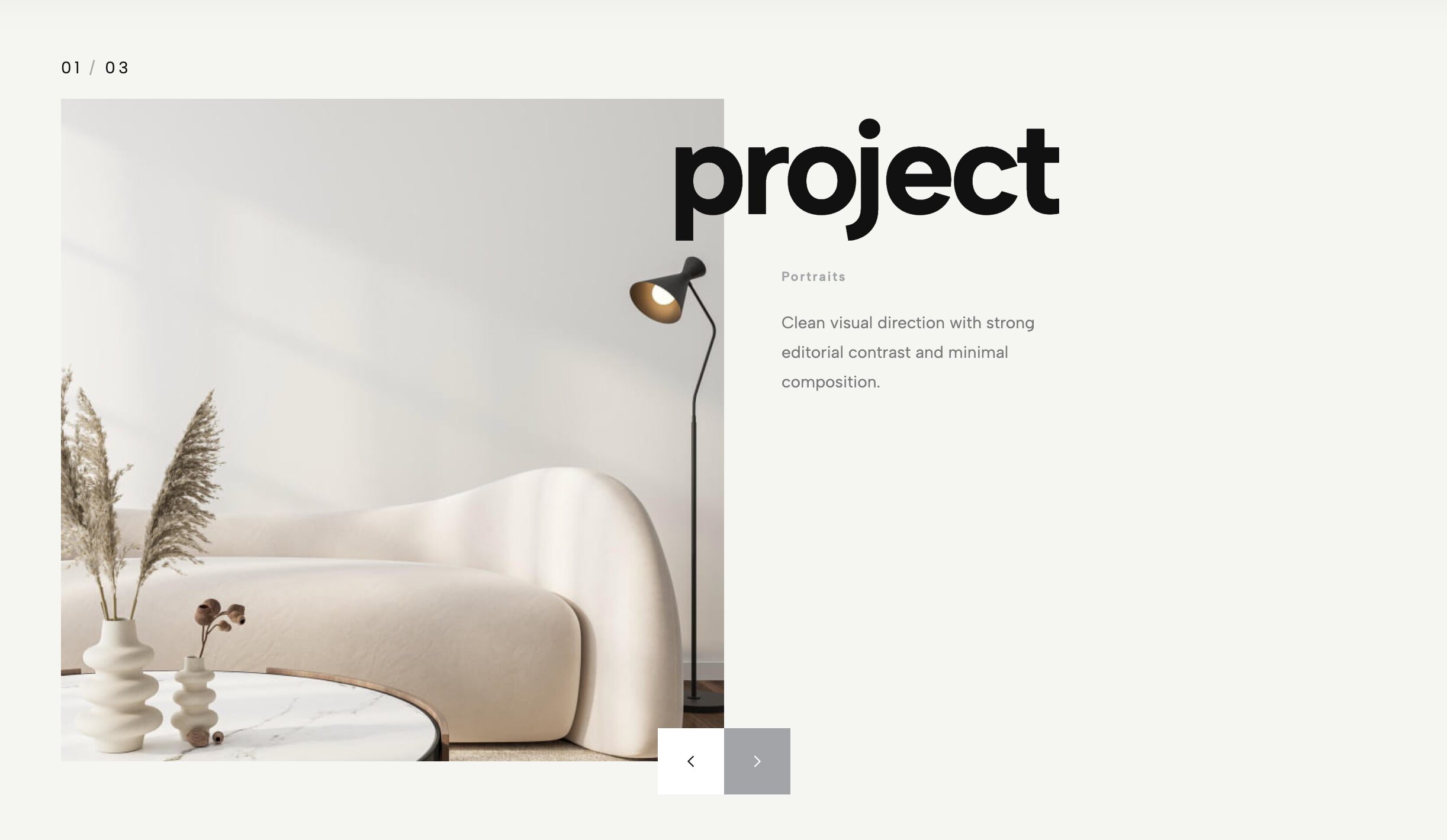
8. Portfolio Overlap Hero

Say goodbye to flat, predictable headers. This layout uses an elegant overlapping structure, layering your high-resolution project images behind and over your typography to create a stunning sense of depth. It effortlessly replaces a standard, boxy text-and-image header with something highly editorial.
Why it works for your portfolio: If you are building a high-end digital showcase, you need a layout that matches your level of expertise. This overlapping aesthetic instantly communicates that your design studio operates at a premium tier, completely breaking away from the limitations of standard platform constraints.
👉 Live Demo: Get it now
9. Awwwards-Style Portfolio Categories Showcase
This is where things get incredibly premium. Instead of a basic grid of images, this layout presents a massive, minimalist list of your project categories or client names. As the user hovers over each text link, a high-quality project image or video smoothly reveals itself in the background or alongside the cursor.
Why it works for your portfolio: This is the pinnacle of cutting-edge web design. It rewards user curiosity with high-end micro-interactions that feel custom-coded. If you are aiming to win design awards or land top-tier tech clients, this is undeniably one of the most effective visual upgrades on the market.
👉 Live Demo: Get it now
10. Tilted Infinite Gallery Slider
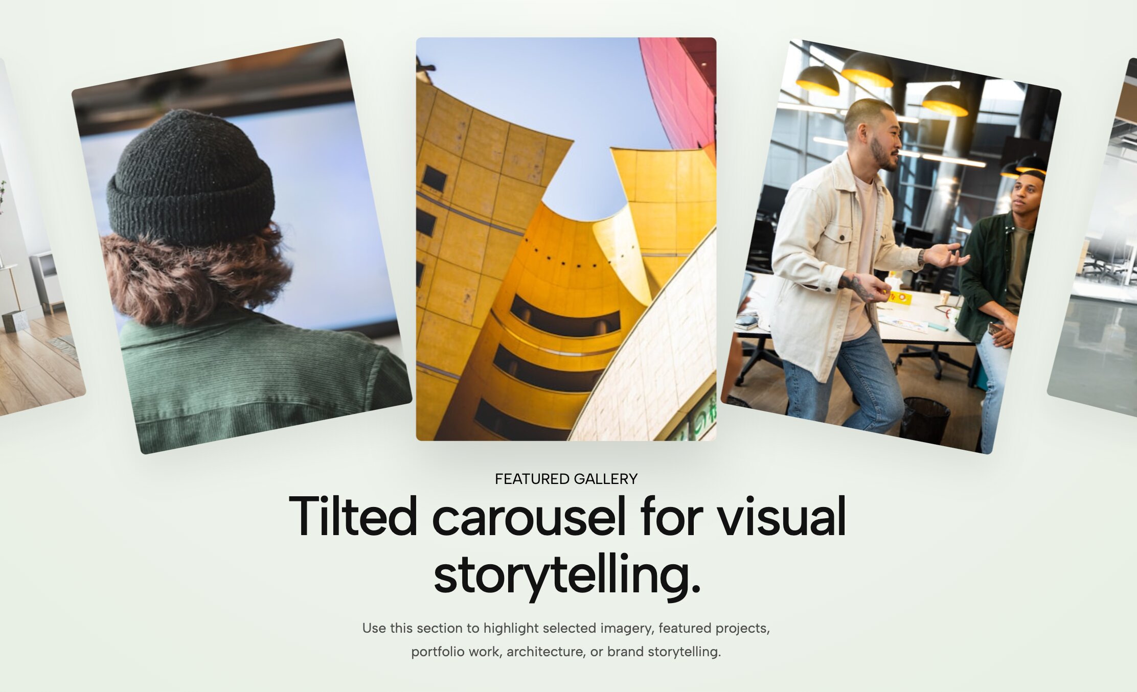
Add immediate, aggressive energy to your site with this diagonal, auto-scrolling gallery. Instead of a traditional horizontal marquee, this widget tilts your imagery on a sharp angle, creating a forward-moving, continuous loop of your best photography or product mockups.
Why it works for your portfolio: Standard out-of-the-box themes are built on rigid, straight lines. By tilting the axis of your gallery, you create visual disruption. It is an edgy, unforgettable layout perfect for fashion photographers, streetwear designers, and disruptive creative agencies who want their work to feel kinetic and alive.
👉 Live Demo: Get it now
11. Portfolio Grid Showcase
While grids are standard, this widget completely reinvents the basic Squarespace gallery block. It offers ultra-smooth hover reveals, seamless category filtering, and refined padding that gives your work room to breathe.
Why it works for your portfolio: Even if you prefer a classic layout, you can still execute it at a world-class level. This interactive grid ensures that your thumbnail images transition beautifully into full case studies. It is the perfect backbone for anyone looking to curate their work in a way that is highly organized but still feels bespoke and premium.
👉 Live Demo: Get it now
12. Split Portfolio Carousel
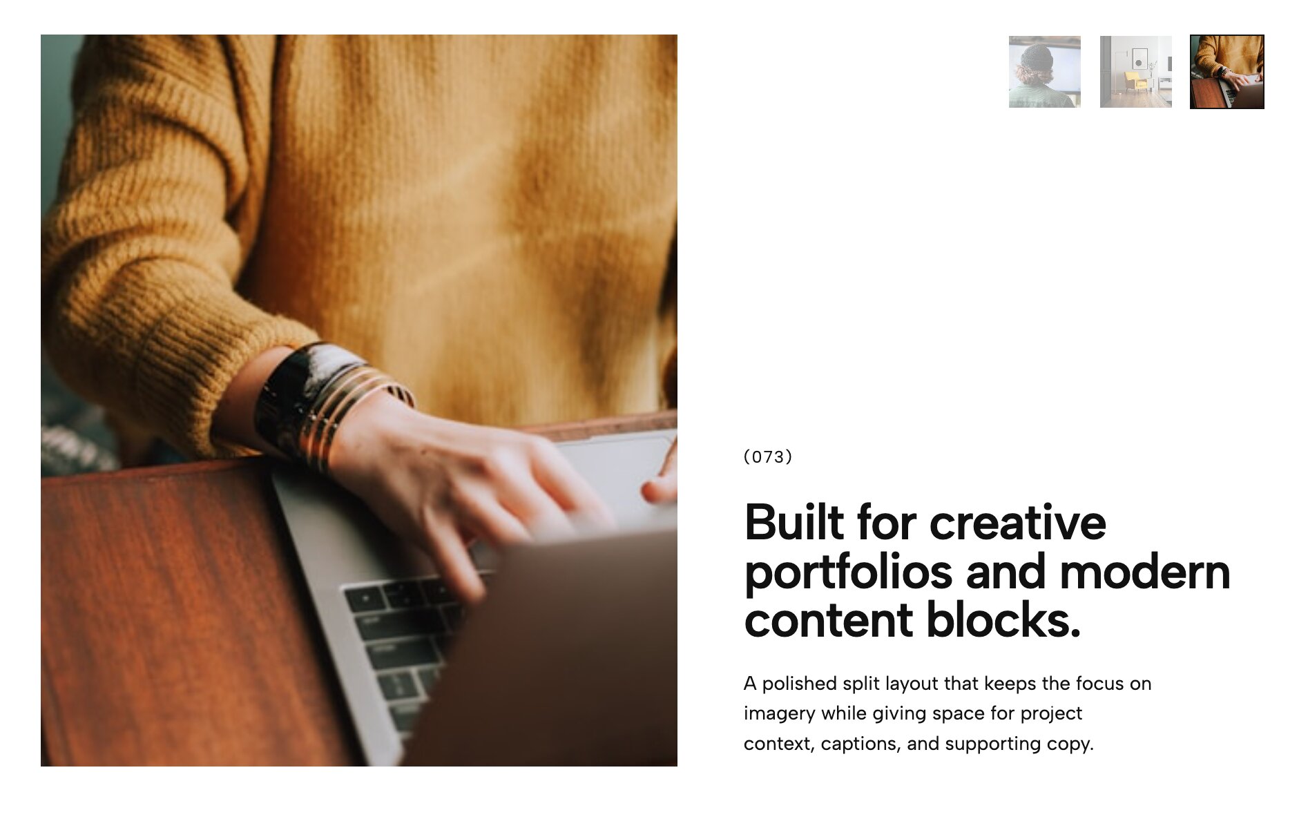
Balance is key in any great design. This widget divides your screen down the middle, creating an elegant split-layout carousel where your project details stay perfectly legible on one side while rich, high-resolution imagery slides past on the other.
Why it works for your portfolio: When you rely on native page layouts, long project descriptions often get pushed below the fold, causing users to scroll past them. This split layout solves that problem by keeping your narrative and your visuals side-by-side, creating a much more cohesive and professional browsing experience.
👉 Live Demo: Get it now
13. Minimalist Portfolio Carousel
Sometimes, the best design is the one that gets out of the way. This widget strips back all the heavy borders, dropshadows, and distracting UI elements, leaving a breathtakingly clean, ultra-minimalist carousel where your work is the sole focus.
Why it works for your portfolio: One of the most important presentation rules is to let the work breathe. If you are a fine art photographer or minimalist brand designer looking to build a sophisticated presence that feels like a high-end digital gallery, this stripped-down aesthetic is absolute perfection.
👉 Live Demo: Get it now
14. Hero Split Slider

This widget takes the split-screen concept and supercharges it for your homepage header. One side locks your introductory copy and call-to-action in place, while the opposite side acts as a dynamic slider cycling through your flagship projects.
Why it works for your portfolio: If you are building a professional creative site, your header needs to communicate your value proposition while showing off your aesthetic. This layout merges those two goals effortlessly, outperforming a static hero image by engaging the user from the very first second.
👉 Live Demo: Get it now
15. Cinematic Portfolio Video List
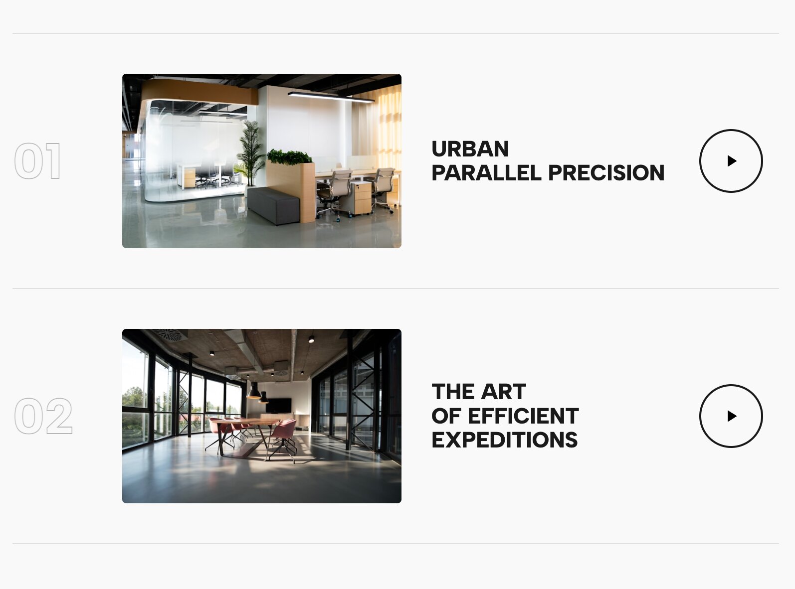
Video is the ultimate engagement tool, but stacking heavy video blocks on a native page can ruin your load times. This layout uses a sophisticated list format where cinematic, auto-playing video snippets are seamlessly integrated into the rows of your project index.
Why it works for your portfolio: Video creates a dynamic user experience that static images simply cannot match. By utilizing this widget, you bring a high-end, reel-like experience directly to your project list, instantly signaling to potential clients that you play in the big leagues.
👉 Live Demo: Get it now
16. Case Study Video List
Taking the video list concept a step further, this layout is designed specifically for deep-dive case studies. It combines bold, readable project titles with expansive video backgrounds that trigger upon interaction, bringing a documentary-style weight to your best client work.
Why it works for your portfolio: When potential clients are searching for premium web experiences, they are looking for substance, not just pretty pictures. This widget allows you to contextualize your projects with motion, making it an incredibly powerful tool for videographers, motion designers, and brand strategists.
👉 Live Demo: Get it now
17. Editorial Work Slider with Thumbs
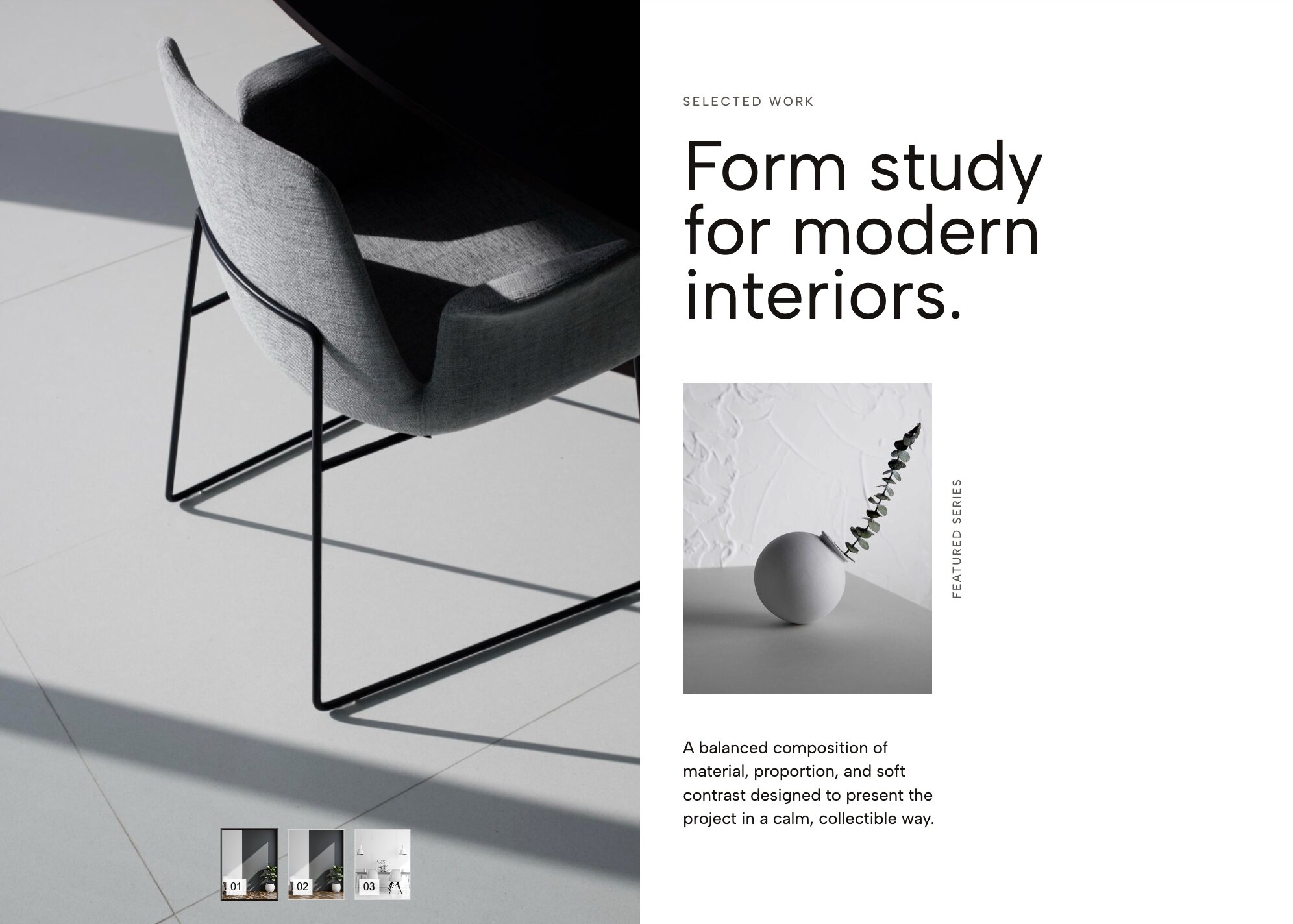
Bring the glossy, high-fashion feel of a print magazine to your digital portfolio. This widget features refined typography and a highly polished slider mechanism driven by elegant, clickable thumbnail previews.
Why it works for your portfolio: To command premium rates, your website needs to look expensive. This layout is easily one of the best display upgrades available, transforming a clunky standard gallery into a bespoke, editorial showcase that fashion, beauty, and lifestyle creatives will absolutely love.
👉 Live Demo: Get it now
18. Service Reveal List (Interactive Image Background)
Instead of a boring bulleted list of your services, this widget creates an unforgettable micro-interaction. It displays a stark, minimalist text list of your capabilities (e.g., "Branding, Web Design, Strategy"). As the user hovers over each service, a massive, full-screen background image dynamically shifts to reflect that specific capability.
Why it works for your portfolio: Modern web interactivity is all about surprising and delighting the user. This widget turns a dry "What I Do" section into a highly visual, exploratory experience, making it impossible for visitors to ignore your range of skills.
👉 Live Demo: Get it now
19. Editorial Masonry Portfolio Slider
Masonry layouts are incredibly popular for creative sites, but they are usually static blocks that require users to scroll forever. This widget changes the game by putting a dynamic masonry grid inside a fluid, horizontally draggable slider. It combines an organic, asymmetrical collage look with smooth, touch-responsive motion.
Why it works for your portfolio: If your work spans multiple mediums (like art direction, packaging, and photography), you need a layout that handles mixed asset sizes gracefully. This is one of the most versatile presentation layouts because it organizes diverse content beautifully without looking stiff, allowing you to build an impressive visual tapestry.
👉 Live Demo: Get it now
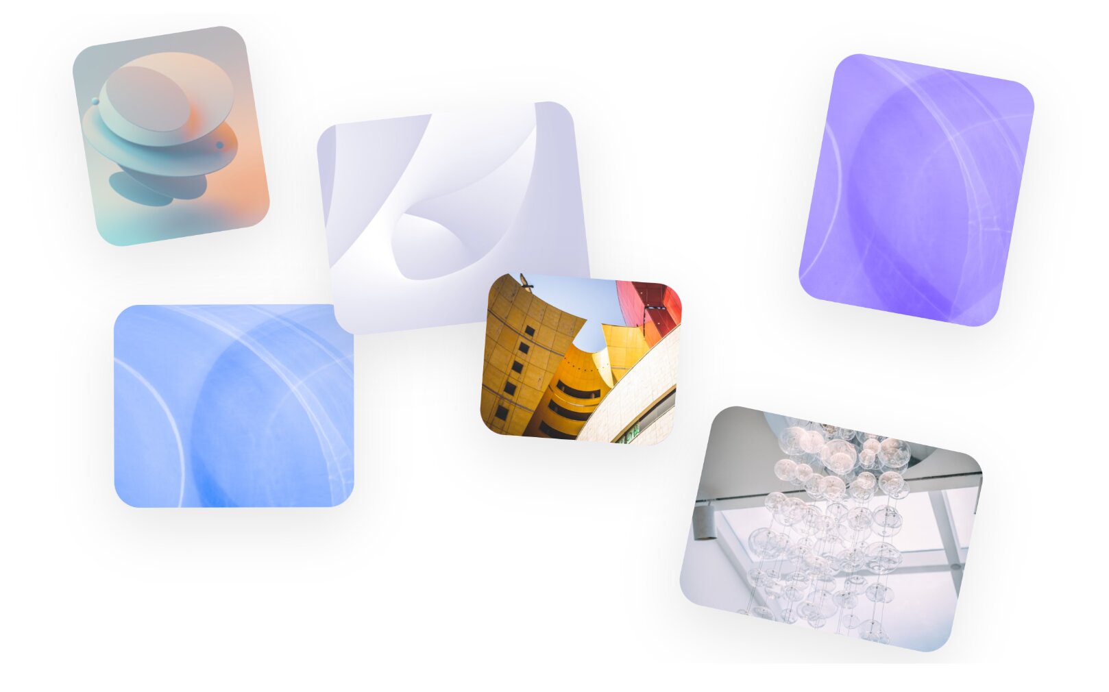
20. Kinetic Stardust Hero (Animated Image Cloud)

Make a statement the exact millisecond your page loads. This cutting-edge widget swaps out the typical text header for a mesmerizing, floating cloud of images that drifts weightlessly and reacts dynamically as the user moves their mouse.
Why it works for your portfolio: If you want to design a digital space that feels ahead of its time, you have to break away from traditional grids entirely. For an art director's showcase, this "stardust" animation acts as an unforgettable interactive hook, scattering your best campaign imagery in a fluid, weightless environment that leaves cookie-cutter layouts in the dust.
👉 Live Demo: Get it now
21. Work Hero Slider with Title Overlap
Typography and imagery shouldn't just sit next to each other—they should interact. This premium hero slider pushes massive, bold project titles directly over your high-contrast imagery, using clever layered depth and mask interactions to ensure both elements look stunning simultaneously.
Why it works for your portfolio: When studying successful top-tier creative portfolios, you’ll notice the top 1% all have headers that feel incredibly intentional. This widget delivers that precise, high-end editorial feel right out of the box, offering a brilliant solution for designers who want to showcase their typography skills and project photography in perfect harmony.
👉 Live Demo: Get it now
Upgrade Your Portfolio Without Touching a Line of Code
Seeing these premium layouts is one thing, but figuring out how to implement them usually involves wrestling with complex custom CSS, accidentally breaking your site’s formatting, or paying a web developer thousands of dollars.
Fortunately, it does not have to be that way. It is actually incredibly easy to bring these high-end, interactive widgets to your native Squarespace site—zero coding knowledge required.
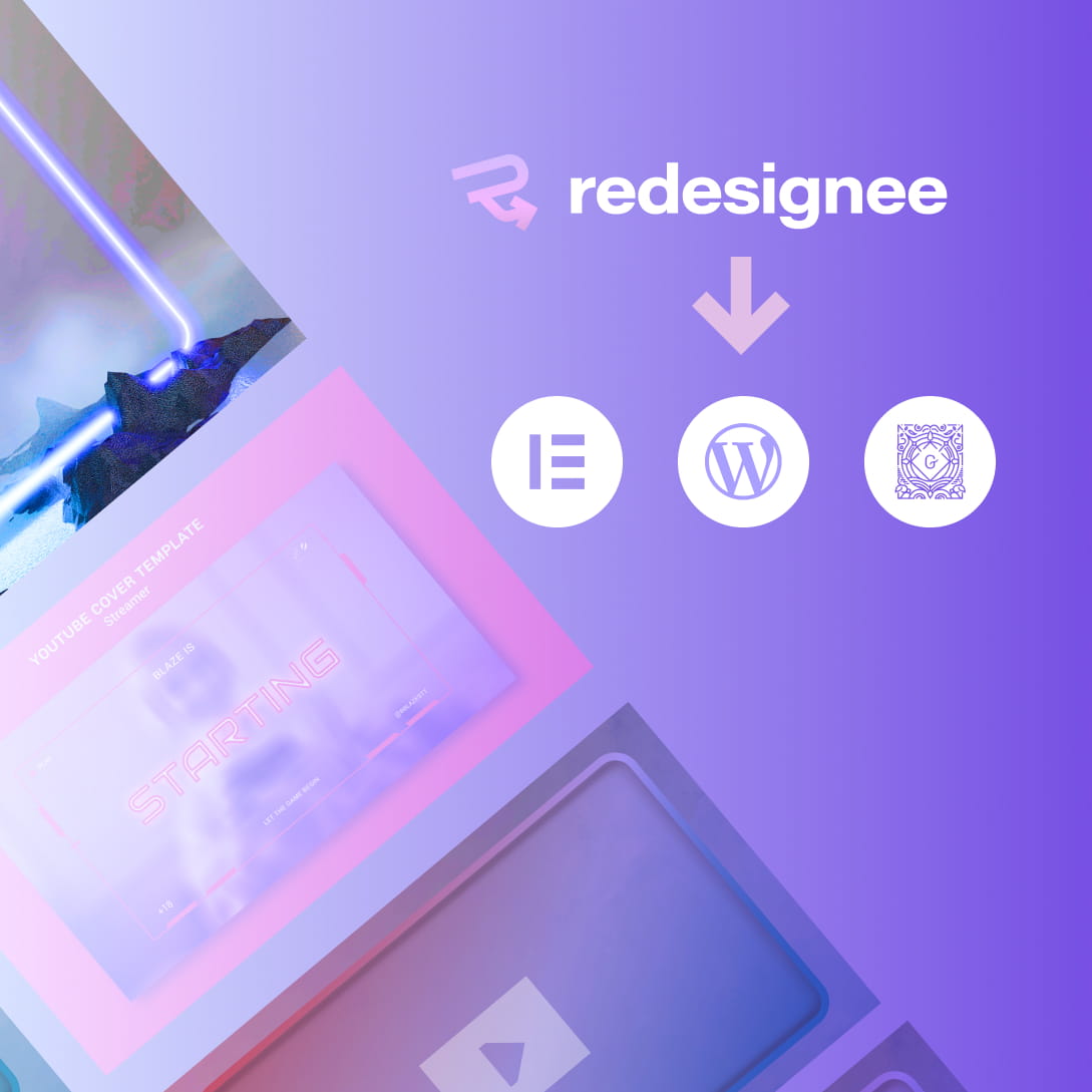
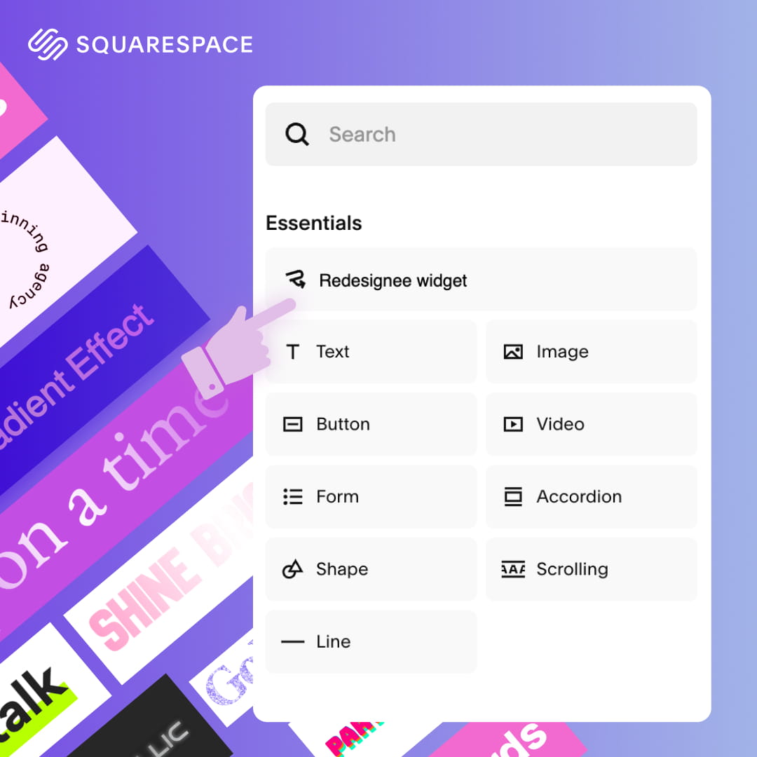
All you have to do is connect your website to the Redesignee Squarespace Extension.
Once your site is linked, you can bypass the technical headaches entirely. The native integration allows you to browse our entire library of premium layouts and drop them directly into your pages seamlessly. Stop settling for the same generic templates everyone else is using. Connect your site today, drop in your favorite widgets, and transform your portfolio from a basic grid into an unforgettable, interactive experience in a matter of minutes!
Comments (0)