
Let’s be honest: most "Meet the Team" pages are entirely forgettable. A grid of stiff, corporate headshots doesn’t communicate “innovation”. It just screams "generic template."
Whether you’re running a creative agency, a law firm, or a scaling tech startup, your team page is frequently one of the most-visited sections of your site. It’s where prospects go to decide if they trust the people behind the brand.
The good news? You don’t need a massive budget or weeks of custom dev to fix it. Design is about perception, and subtle, modern layouts can instantly shift your brand from "stiff" to "professional and creative."
If you’re ready to ditch the flat, static look, here are 11 snappy, interactive ways to bring your team page to life:
1. Bento Team Grid

The Look: A clean, puzzle-like aesthetic. It breaks the monotony of uniform rows by mixing photo sizes for a modern, asymmetrical feel.
Great for: Giving your founders or leadership team the spotlight they deserve.
👉 Live Demo: Get it now
2. Team Lens Reveal

The Look: Smooth and minimalist. The page stays totally clean until a user hovers over a photo, revealing names and details through a sharp, fluid lens effect.
Great for: A modern, tech-forward, or high-end corporate feel.
👉 Live Demo: Get it now
3. Vertical Team Accordion

The Look: Photos expand and slide open like a premium deck of cards, packing a ton of info into a tiny, elegant space.
Great for: Showcasing a close-knit core team without cluttering the page.
👉 Live Demo: Get it now
4. Animating Scattered Team Bubbles

The Look: Floating, bouncy bubbles that add instant life and motion to a page.
Great for: Creative agencies, startups, or brands that want to show off a fun personality.
👉 Live Demo: Get it now
5. Minimal Team Grid Image Swap

The Look: Instant magic. Hovering over a photo flips it instantly—perfect for a "professional vs. funny" face swap that makes clients smile.
Great for: Showing the human, approachable side of your company.
👉 Live Demo: Get it now
6. Interactive Team Flip Grid

The Look: Tactile and snappy. Photos flip over seamlessly to show bios and social links on the back, keeping the layout perfectly neat.
Great for: Highlighting team credentials and LinkedIn profiles cleanly.
👉 Live Demo: Get it now
7. Circular Text Portraits

The Look: A polished, designer edge. Spinning, circular text wraps around crisp portraits to give your site a high-end boutique feel.
Great for: Architecture firms, fashion brands, or premium consultants.
👉 Live Demo: Get it now
8. Portrait Case Study Slider

The Look: Large portraits glide across the screen in perfect sync with small clickable thumbnails below it.
Great for: Directly connecting your key experts to the projects they led.
👉 Live Demo: Get it now
9. Cinematic Full-Screen Team Hero Slider

The Look: Big first impression. Massive, full-screen slides that make your team look like the cast of a premium movie.
Great for: Making a bold statement right at the very top of your homepage.
👉 Live Demo: Get it now
10. Atmospheric Team Hero Slider

The Look: Soft, glowing blurred backgrounds shift behind sharp portraits for a really rich, premium feel.
Great for: Adding subtle visual depth and an immediate sense of luxury.
👉 Live Demo: Get it now
11. Team Member Grid

The Look: The classic grid, perfected. It's traditional, but tuned to be lightning-fast, perfectly aligned, and snappy.
Great for: Large organizations that want a clean, organized, and reliable directory.
👉 Live Demo: Get it now
How to add these Team widgets to your site (in under 5 minutes)
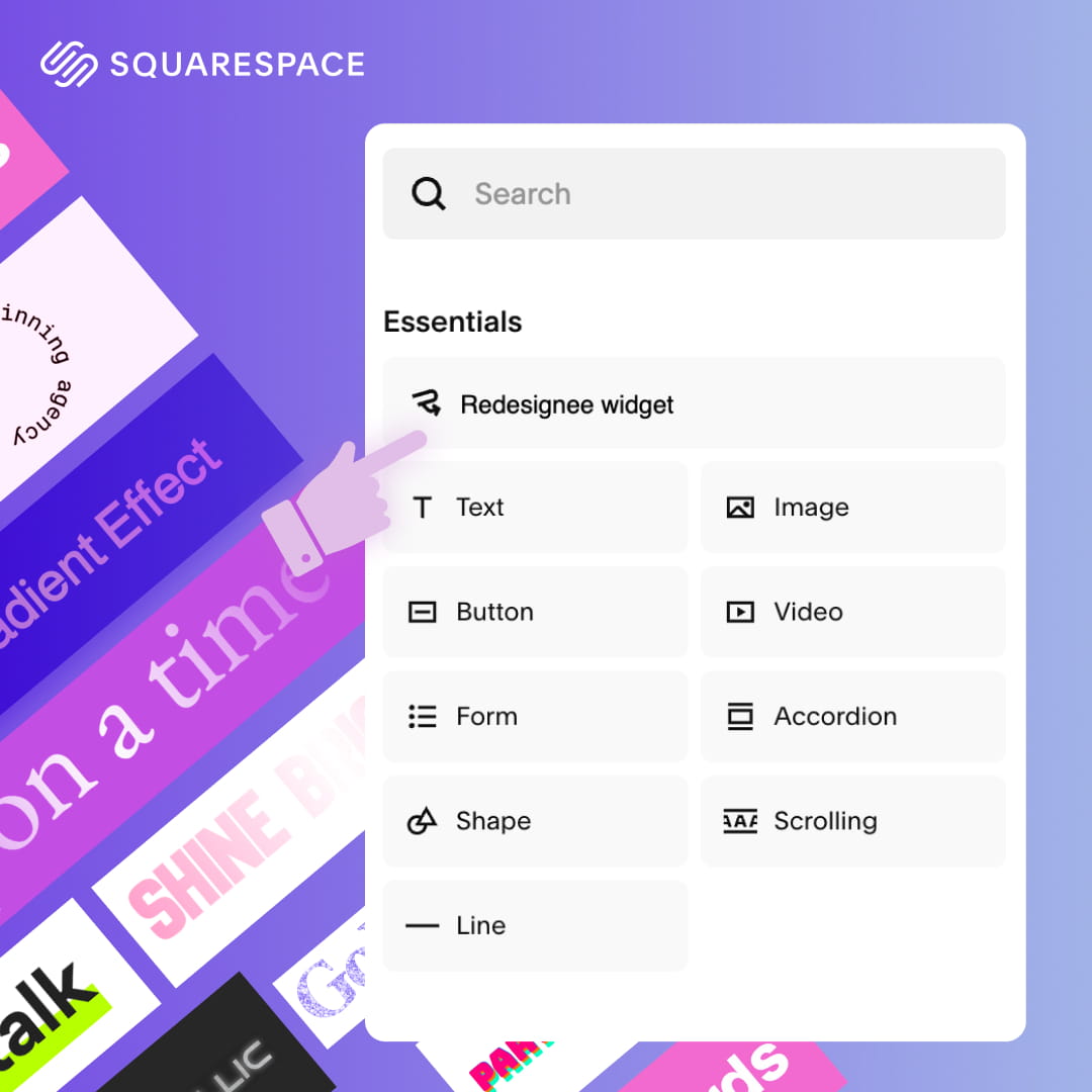
You don’t need to be a developer to pull this off. We built Redesignee as a cloud widget library to make premium design accessible.
The process is simple:
- Pick your preferred style from the library.
- Drop in your own photos and text using your current site builder (WordPress, Squarespace, etc.).
- Copy and paste the lightweight snippet directly onto your page.
Because they’re cloud-delivered, they won’t bloat your code or slow down your site. They only load the exact animation you’re actually using.
Comments (0)