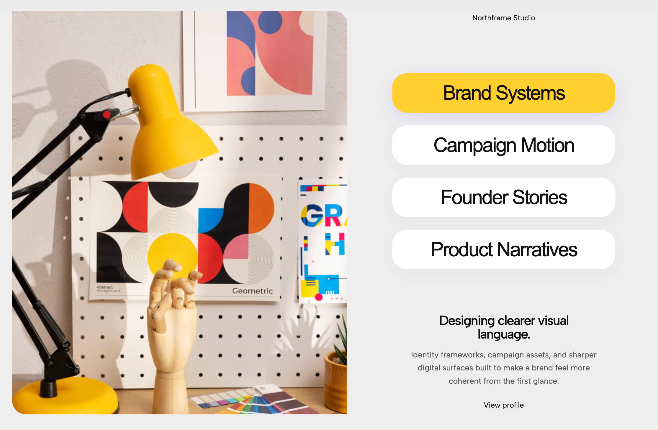
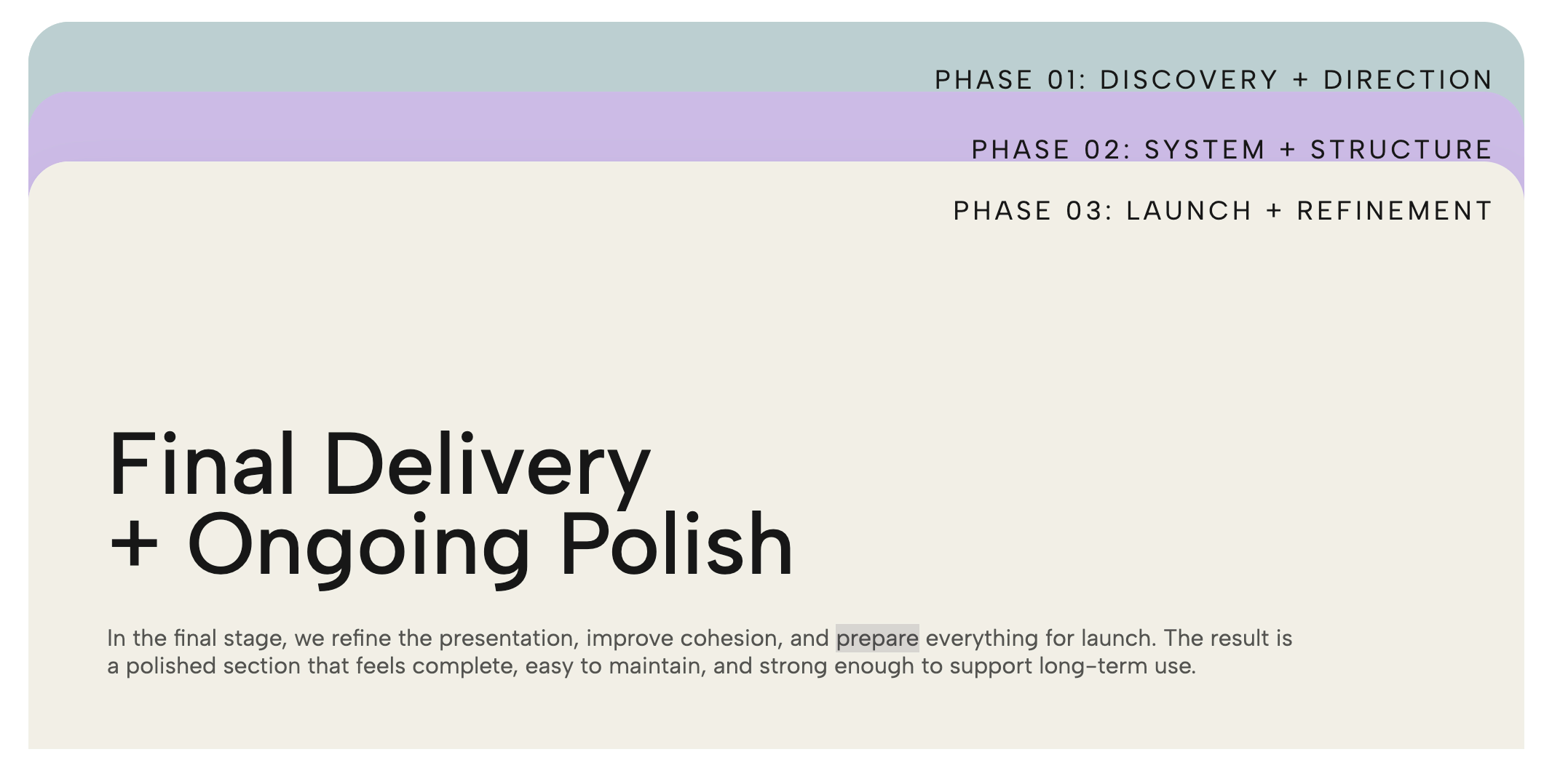
A pink info card with folder-style numbered tabs generated automatically from the number of slides. Each tab has its own editable color, and clicking a tab swaps the headline and body text.
When you need to explain a multi-step process or organize a series of thoughts, long vertical columns of text can feel overwhelming to a visitor. This component solves that by drawing inspiration from physical stationery, turning dense information into a tactile, neatly organized digital file folder.
This widget combines retro-modern minimalism with a highly intuitive, physical interface design.
The Manila Folder Aesthetic: The core of the layout is a large, rounded card that mimics a physical file folder. The soft, diffuse drop shadow gives it a floating, premium feel, making the content pop off the background.
Sequential Numbered Tabs: Tucked neatly into the top-right corner is a cluster of overlapping, color-coded tabs (e.g., 01, 02, 03, 04). The active tab pushes to the front in a warm, contrasting terracotta color, while the inactive tabs use a soft palette of blues, mints, and beiges. This creates a highly clickable, satisfying micro-interaction.
Editorial Typography: The interior of the card features a sophisticated layout. A delicate horizontal line separates the top metadata (like the year "2026" and a category label like "How I work") from the main content. The bold headline ("How can I help your business?") immediately grabs attention, followed by highly readable, well-spaced paragraph text.
The true brilliance of the Info Card Number Tabs is its intuitive sequential storytelling in a compact footprint.
Because the tabs are numbered, the user immediately understands that this is a guided journey. Instead of scrolling endlessly to read about your onboarding process or service pillars, they can click through the steps at their own pace. The physical metaphor of a folder makes the navigation instantly recognizable, reducing friction while injecting a heavy dose of design-forward personality into your site.
Because of its warm, approachable color palette and sequential structure, this widget is perfect for brands and professionals who want to build trust and outline clear expectations. It is highly effective in the following scenarios:
Freelancer & Creative Portfolios: As shown in the preview, it is absolutely perfect for a "How I work" section, allowing you to break down your client process (e.g., 01. Discovery, 02. Strategy, 03. Design, 04. Launch).
Agency Service Methodologies: Walk prospective clients through your proprietary framework or marketing phases without cluttering your landing page.
SaaS Onboarding: Use it on a product page to show users exactly how easy it is to get started in four simple steps.
Core Values & Mission: Cycle through your company's founding principles, giving each value its own dedicated, beautifully formatted tab.
Bring this layout to life on your website in just a few clicks.

Edit Info Card Number Tabs visually using the native Squarespace extension
First, ensure you have connected your website to the native Redesignee extension. Once connected, you have two easy ways to build:
Native Block: Simply add the native Redesignee Widget Block directly from the fluid engine editor menu inside Squarespace.
Manual Markdown: Add a standard Code Block, paste your widget’s code snippet, and the Redesignee floating "Customize" button will automatically appear right over the block.
Both methods let you tweak settings, copy items, and design visually in real time. Saving your changes syncs the updates instantly to your live page.
See Squarespace installation guide
Connect natively via Gutenberg or Elementor
Make sure you have the free Redesignee WordPress Plugin installed. To drop the Info Card Number Tabs into Elementor, simply drag and drop the Redesignee widget from your sidebar. If you are using the Gutenberg Block Editor, click the " + " icon and select the Redesignee Block. Launch the Cloud Library directly inside your workspace, choose your customized template, and import it with a single click. It automatically inherits your theme fonts and styles!
WordPress plugin installation guide
Quick copy-and-paste for custom setups
If you are using Webflow, Shopify, Wix, or a custom HTML site, click the "Export Widget" button on this page and ensure the platform selector is set to "HTML". Click "Copy" to copy the clean, un-nested source code snippet directly to your clipboard. Paste this code into any HTML component, Code Block, or Embed tool inside your website builder. All styles, animations, and scripts are self-contained and ready to run.
This Info Card Number Tabs widget is optimized and categorized inside the following layout packs:
Bring asymmetric, magazine-style aesthetics to your web project canvas. Browse editorial grids and refined typography elements from our cloud repository and copy-paste clean code rows.
Make your layouts stand out instantly. Tweak advanced visual elements inside our cloud design workspace, copy the lightweight framework strings, and drop them seamlessly onto your canvas.
Published:
Jul 18, 2026 06:35 AM
Category:
Tags: