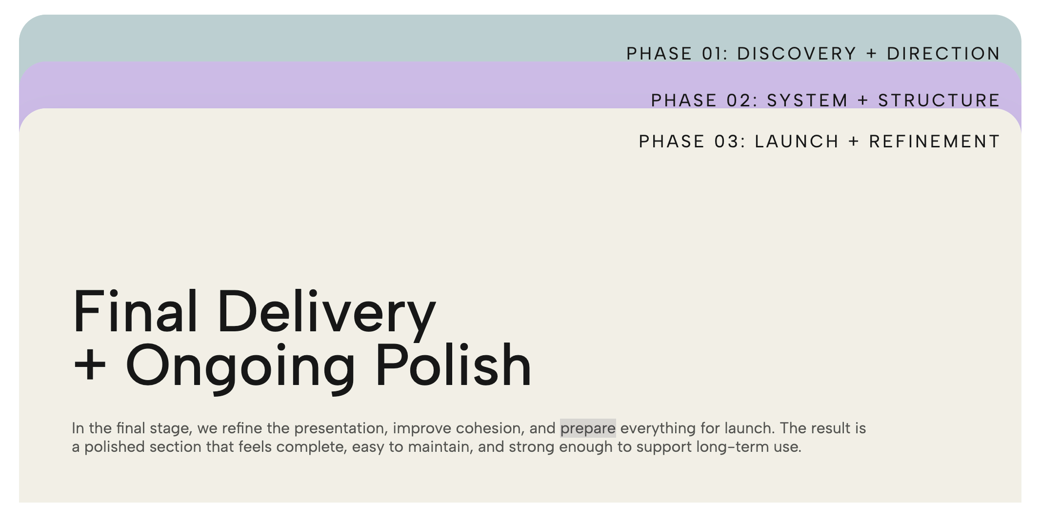
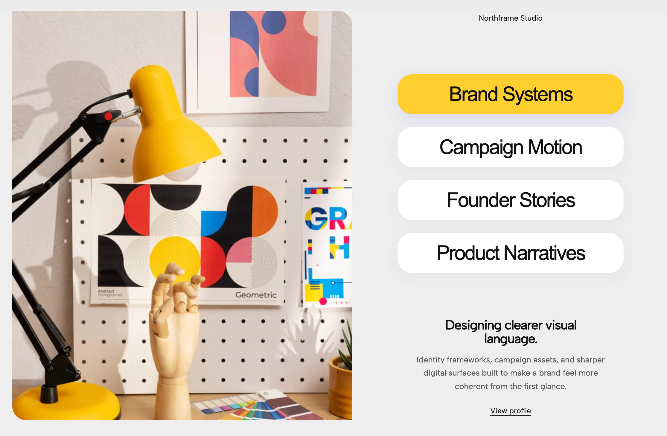
A minimalist white card with clickable colorful pill tabs on the right edge. Clicking each pill switches the headline and brand text shown on the card, with independently editable pill colors.
Standard tabbed layouts often rely on rigid, corporate-looking horizontal text bars. This component flips that convention on its head, delivering a fresh, tactile experience where clicking on the colorful, protruding side pills instantly swaps the content within the main card.
This widget marries clean minimalism with a pop of creative flair, drawing inspiration from modern app interfaces and tactile graphic design.
The Floating Canvas: The core of the design is a pristine, white, rounded-rectangle card. A soft, diffuse drop shadow lifts it off the background, creating a premium, lightweight feel that draws the eye directly to the typography.
Peek-a-Boo Pill Navigation: Instead of standard text links, the tab navigation is handled by three colorful half-pill shapes (vibrant green, soft periwinkle, and warm salmon) emerging from the right edge of the card. This creates a highly clickable, physical aesthetic—like tabs on a physical file folder or a beautifully designed notebook.
Focused Typography: The interior of the card features large, bold, high-contrast typography (e.g., "Explore what true creativity can unlock"). By keeping the text alignment clean and the layout uncluttered, the message remains the undeniable focal point.
The brilliance of the Creative Tabs Card lies in its deceptive simplicity and space-saving interactivity.
By moving the navigation to the side as abstract color blocks, you remove visual clutter from the primary reading area. It allows you to condense three distinct value propositions, service pillars, or brand statements into one compact footprint. The physical act of clicking a colorful tab and watching the text instantly swap creates a micro-interaction that surprises and delights the user, keeping them engaged with your content far longer than a static paragraph would.
Because of its sleek, slightly playful, and highly modern aesthetic, this layout is perfect for brands that want to showcase innovation and personality. It is highly effective in the following scenarios:
Creative Agencies & Studios: Perfect for a homepage section highlighting your core competencies (e.g., Green for Strategy, Blue for Design, Pink for Development).
SaaS Product Features: Use the card to explain a core product benefit, letting users click the colored pills to cycle through specific features (like speed, security, and integration).
Portfolio "About Me" Sections: A fantastic way for designers or freelancers to condense their personal manifesto, core skills, and contact information into an engaging, interactive UI element.
Brand Value Statements: Highlight your company's mission, vision, and core values in a tight, beautifully designed block that encourages the user to physically interact with your brand's ethos.
Bring this layout to life on your website in just a few clicks.

Edit Creative Tabs Card visually using the native Squarespace extension
First, ensure you have connected your website to the native Redesignee extension. Once connected, you have two easy ways to build:
Native Block: Simply add the native Redesignee Widget Block directly from the fluid engine editor menu inside Squarespace.
Manual Markdown: Add a standard Code Block, paste your widget’s code snippet, and the Redesignee floating "Customize" button will automatically appear right over the block.
Both methods let you tweak settings, copy items, and design visually in real time. Saving your changes syncs the updates instantly to your live page.
See Squarespace installation guide
Connect natively via Gutenberg or Elementor
Make sure you have the free Redesignee WordPress Plugin installed. To drop the Creative Tabs Card into Elementor, simply drag and drop the Redesignee widget from your sidebar. If you are using the Gutenberg Block Editor, click the " + " icon and select the Redesignee Block. Launch the Cloud Library directly inside your workspace, choose your customized template, and import it with a single click. It automatically inherits your theme fonts and styles!
WordPress plugin installation guide
Quick copy-and-paste for custom setups
If you are using Webflow, Shopify, Wix, or a custom HTML site, click the "Export Widget" button on this page and ensure the platform selector is set to "HTML". Click "Copy" to copy the clean, un-nested source code snippet directly to your clipboard. Paste this code into any HTML component, Code Block, or Embed tool inside your website builder. All styles, animations, and scripts are self-contained and ready to run.
This Creative Tabs Card widget is optimized and categorized inside the following layout packs:
Convert your product traffic effortlessly. Tweak tech-focused feature sections and pricing tables in our cloud library, grab the optimized code, and paste them directly into your layout.
Embrace pristine minimal structures. Tweak crisp whitespace templates visually inside our cloud canvas layout, copy the fast-rendering script output, and paste it straight onto your host site.
Make your layouts stand out instantly. Tweak advanced visual elements inside our cloud design workspace, copy the lightweight framework strings, and drop them seamlessly onto your canvas.
Published:
Jul 18, 2026 06:12 AM
Category: