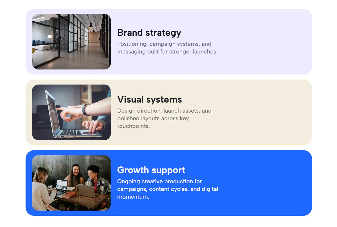
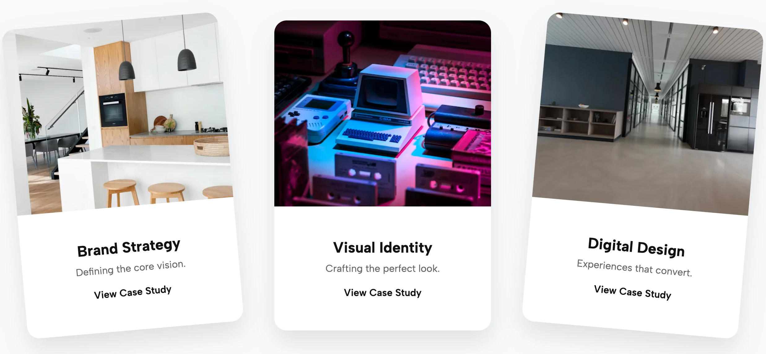
Command attention and drive conversions with the High-Contrast Bold Feature Grid. Inspired by the industry-leading design systems of top B2B SaaS brands (like Gong), this widget abandons generic stock imagery in favor of bold, authoritative typography and high-impact color blocking.
The design philosophy here is "Content is King." The layout features a responsive grid of tall, substantial cards that alternate between three distinct themes: Deep Purple (Dark), Clean White (Light), and Vibrant Violet (Accent). This rhythm keeps the user engaged as they scan through your value propositions or core benefits.
The standout feature of this widget is its Rich Text Accent Logic. You don't need to be a coder to create emphasis; simply formatting a word as bold within the editor automatically applies a high-contrast accent color (e.g., turning white text to neon purple on a light card). This allows marketing teams to highlight key "power words" instantly. With full Rich Text support, you can include multiple paragraphs, lists, or headers within each card, making it a versatile tool for storytelling.
Key Features:
Bring this layout to life on your website in just a few clicks.

Edit High-Contrast Bold Feature Grid - Text-First Benefit Cards visually using the native Squarespace extension
First, ensure you have connected your website to the native Redesignee extension. Once connected, you have two easy ways to build:
Native Block: Simply add the native Redesignee Widget Block directly from the fluid engine editor menu inside Squarespace.
Manual Markdown: Add a standard Markdown Block, paste your widget’s code snippet, and the Redesignee floating "Customize" button will automatically appear right over the block.
Both methods let you tweak settings, copy items, and design visually in real time. Saving your changes syncs the updates instantly to your live page.
See Squarespace installation guide
Connect natively via Gutenberg or Elementor
Make sure you have the free Redesignee WordPress Plugin installed. To drop the High-Contrast Bold Feature Grid - Text-First Benefit Cards into Elementor, simply drag and drop the Redesignee widget from your sidebar. If you are using the Gutenberg Block Editor, click the " + " icon and select the Redesignee Block. Launch the Cloud Library directly inside your workspace, choose your customized template, and import it with a single click. It automatically inherits your theme fonts and styles!
WordPress plugin installation guide
Quick copy-and-paste for custom setups
If you are using Webflow, Shopify, Wix, or a custom HTML site, click the "Export Widget" button on this page and ensure the platform selector is set to "HTML". Click "Copy" to copy the clean, un-nested source code snippet directly to your clipboard. Paste this code into any HTML component, Code Block, or Embed tool inside your website builder. All styles, animations, and scripts are self-contained and ready to run.
This High-Contrast Bold Feature Grid - Text-First Benefit Cards widget is optimized and categorized inside the following layout packs:
Scale your studio production in record time. Access professional agency sections from our cloud workspace, tweak them visually, and drop clean, native elements straight into your client builds.
Convert your product traffic effortlessly. Tweak tech-focused feature sections and pricing tables in our cloud library, grab the optimized code, and paste them directly into your layout.
Make an unmissable statement. Customize high-impact typography elements, brutalist layouts, and high-contrast sections from our cloud repository to craft layouts that refuse to be ignored.
Bring asymmetric, magazine-style aesthetics to your web project canvas. Browse editorial grids and refined typography elements from our cloud repository and copy-paste clean code rows.
Make your layouts stand out instantly. Tweak advanced visual elements inside our cloud design workspace, copy the lightweight framework strings, and drop them seamlessly onto your canvas.
Published:
Jan 18, 2026 07:43 AM
Category: