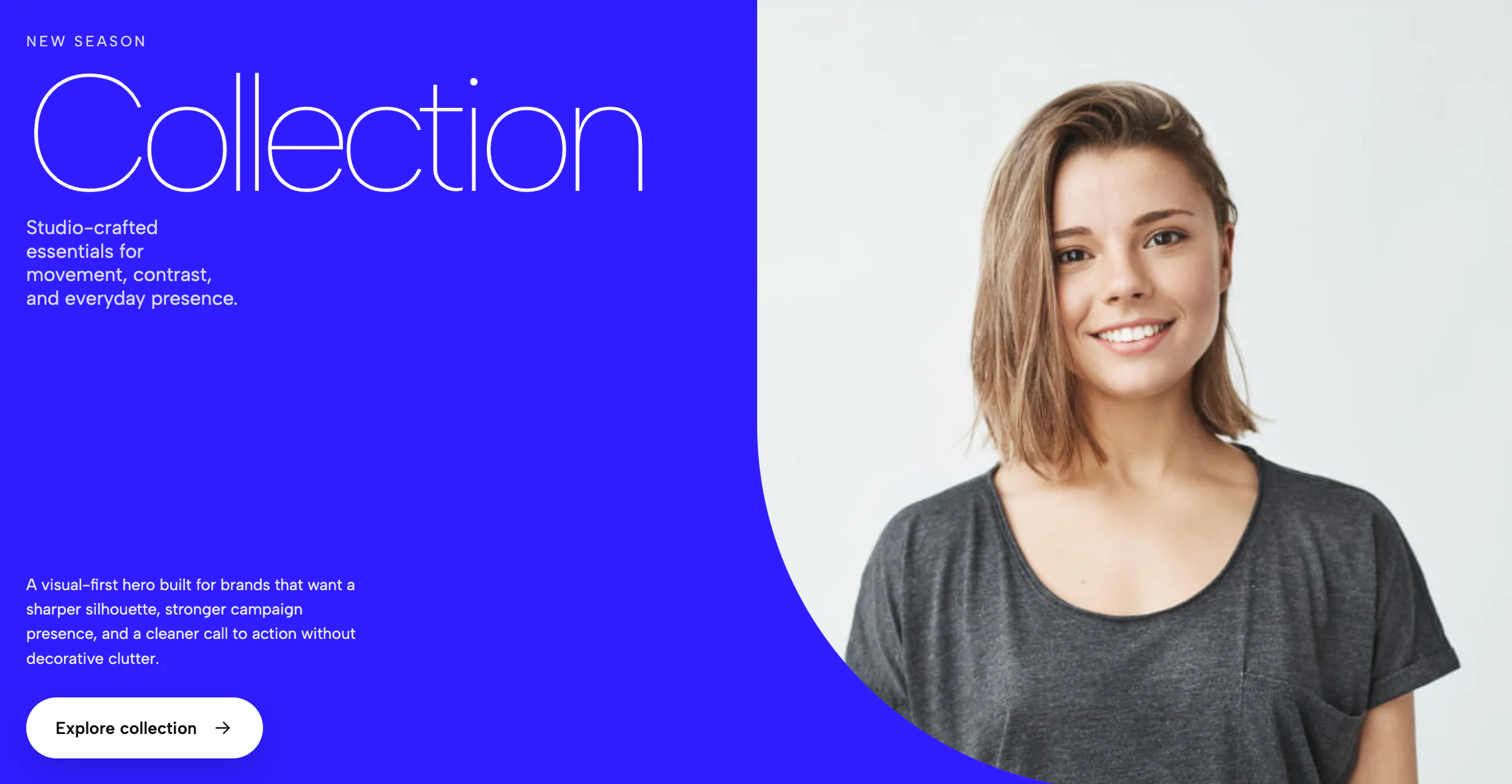
This widget is a bold, motion-driven hero section built around a split composition: a strong headline, a central image panel, and layered marquee text that creates a sense of movement and depth. It is designed to feel editorial and high-impact, with the text acting almost like a graphic element rather than a standard headline. The result is a hero that immediately establishes a brand’s tone before the user reads any supporting copy.
Visually, the widget combines several effects at once. There is a filled marquee running behind the image panel, an outlined marquee crossing over the image area, and a central visual block that anchors the composition. That layered structure makes the design feel dynamic without relying on clutter, and it gives the widget a very distinct identity compared with a standard static banner.
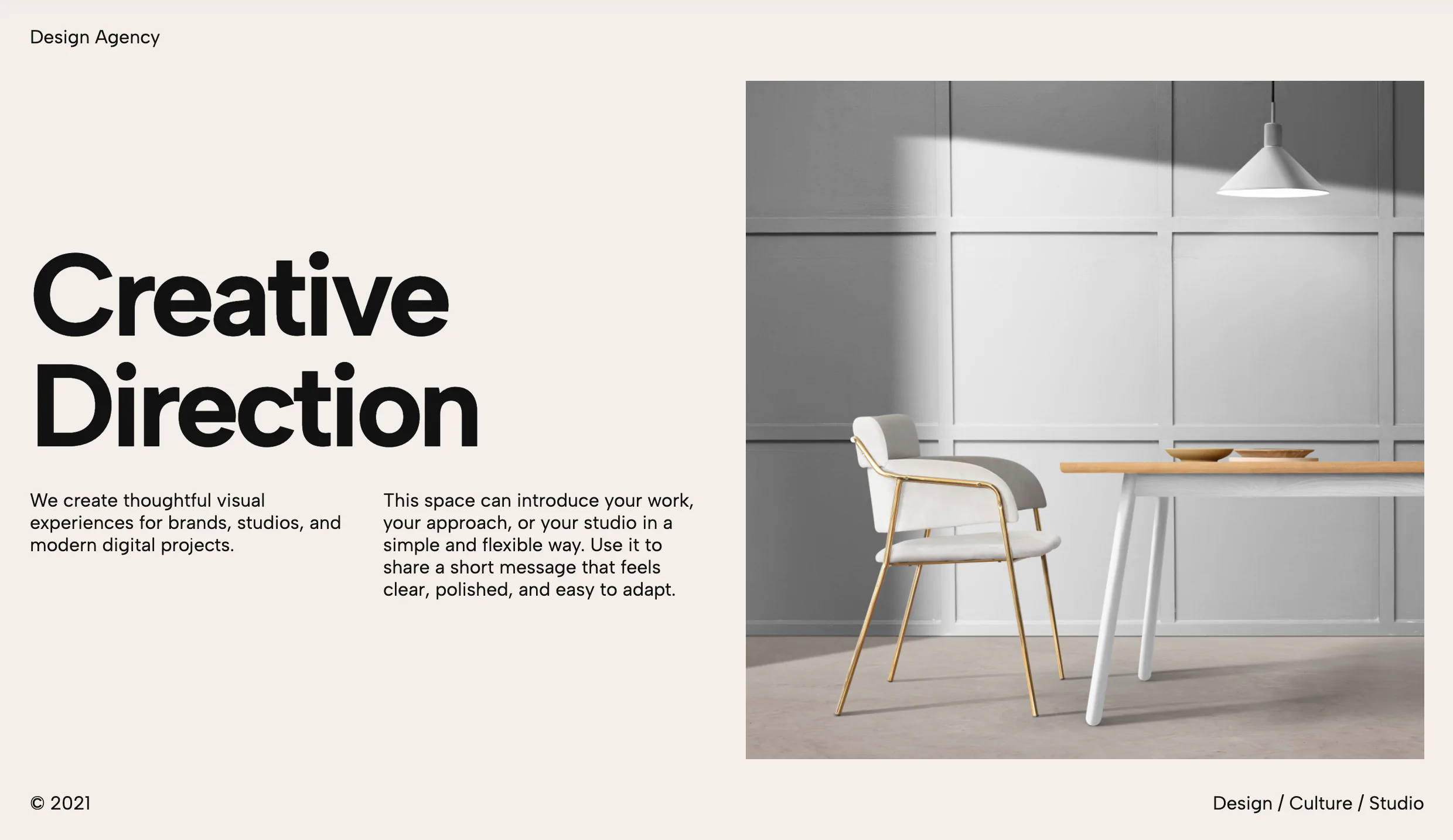
The widget is especially useful anywhere you want a landing-page hero to feel premium, contemporary, and memorable. It would work well for creative agencies, portfolios, architecture studios, fashion brands, product launches, editorial showcases, and experiential campaigns. It can also be used in boutique ecommerce, event promos, or brand storytelling pages where the goal is to create immediate visual interest rather than simply present information.
One of its strongest features is the marquee system. The text loops continuously, and the code is built to support repeated content so the animation can remain seamless even when the headline is short. That makes it ideal for variable copy lengths, because the design still works whether the marquee contains a few words or a longer phrase.
Another feature is the outlined-over-image effect. The headline does not just sit above the image; it intersects the image area and changes styling there, which creates a layered, poster-like look. This is useful for brand design because it turns typography into part of the composition instead of treating it as separate from the visual.
The widget also supports editable content regions, which means the headline, supporting labels, and CTA text can be changed in a customizer without rebuilding the component. That makes it practical for templates and theme systems where non-technical users need to update content quickly. The image itself can also be swapped, which lets the same hero structure adapt to many campaigns or products.
From a UX perspective, the widget works best as a single high-stakes opening section. It is not meant to be repeated many times on a page. Instead, it serves as a focal point that sets mood, communicates a brand personality, and transitions the user into the rest of the page content. If used well, it can make a landing page feel much more designed and less generic.
It also includes motion behavior that helps the hero feel alive. The text animates in, the marquee loops, and the layered elements create motion even when the page is otherwise simple. At the same time, it can be adapted for reduced-motion preferences, so the experience remains accessible.
In short, this widget is a cinematic hero block that blends typography, image, and motion into one strong first impression. It is best used when you want the page to feel expressive, modern, and visually memorable, especially in contexts where the headline itself should act like part of the artwork.
Bring this layout to life on your website in just a few clicks.
Edit visually using the extension or native blocks
First, ensure you have pasted the global Redesignee connector script into your site's Code Injection settings. Once connected, you have two easy ways to build:
Native Block: Simply add the native Redesignee Widget Block directly from the fluid engine editor menu inside Squarespace.
Manual Markdown: Add a standard Markdown Block, paste your widget’s code snippet, and the Redesignee floating "Customize" button will automatically appear right over the block.
Both methods let you tweak settings, copy items, and design visually in real time. Saving your changes syncs the updates instantly to your live page.
See Squarespace installation guide
Connect natively via Gutenberg or Elementor
Make sure you have the free Redesignee WordPress Plugin installed. If you are using Elementor, simply drag and drop the Redesignee widget from your sidebar. If you are using the Gutenberg Block Editor, click the " + " icon and select the Redesignee Block. Launch the Cloud Library directly inside your workspace, choose your customized template, and import it with a single click. It automatically inherits your theme fonts and styles!
WordPress plugin installation guide
Quick copy-and-paste for custom setups
If you are using Webflow, Shopify, Wix, or a custom HTML site, click the "Export Widget" button on this page and ensure the platform selector is set to "HTML". Click "Copy" to copy the clean, un-nested source code snippet directly to your clipboard. Paste this code into any HTML component, Code Block, or Embed tool inside your website builder. All styles, animations, and scripts are self-contained and ready to run.
This Marquee Overlay Hero widget is optimized and categorized inside the following layout packs:
Stop building grid layouts from scratch. Browse our cloud library, customize interactive showcase sections visually, and copy-paste pristine code directly onto your design canvas.
Scale your studio production in record time. Access professional agency sections from our cloud workspace, tweak them visually, and drop clean, native elements straight into your client builds.
Make an unmissable statement. Customize high-impact typography elements, brutalist layouts, and high-contrast sections from our cloud repository to craft layouts that refuse to be ignored.
Deploy sleek, night-mode interfaces effortlessly. Browse dark-mode cards, dashboards, and deep contrast hero layouts from our cloud library, customize styles visually, and copy-paste clean code.
Bring asymmetric, magazine-style aesthetics to your web project canvas. Browse editorial grids and refined typography elements from our cloud repository and copy-paste clean code rows.
Make your layouts stand out instantly. Tweak advanced visual elements inside our cloud design workspace, copy the lightweight framework strings, and drop them seamlessly onto your canvas.
Published:
May 10, 2026 06:41 AM
Category: